Back
Timezone: Local  (UTC +1)
User ID:
Language:
English
User Risk:
Low
10/01/2026
28/12/2025
Utility Bill
Emma Gracias
Emma Garcia
20 CourtRoad, Porto, 1399-00
Period statement from
28 Nov 2025
Period statement until
28 Dec 2025
Usage (kWh)
30
Cost per (kWh)
10
Amount (€)
300
Utility Bill
Emma Gracias
Emma Garcia
20 CourtRoad, Porto, 1399-00
Period statement from
10 Dec 2025
Period statement until
10 Jan 2026
Usage (kWh)
250
Cost per (kWh)
8
Amount (€)
2000
Location Details
Residence
Portugal
Current IP country
USA (15 days)
Partially Restricted
Checklist
The inputted name is the same as the document
Escalate
Escalate
Reject
Reject
Approve
Approve
Approve Proof of Residence
You are approving the Proof of Residence for Emma Garcia
User ID:
273498GH13SDC997AS9
Each item must be cleared i order to proceed with the approval:
Information provided is all correct.
Reject Proof of Residence
You are rejecting the Proof of Residence for Emma Garcia
User ID:
273498GH13SDC997AS9
Reason flagged to reject
The inputted name is the same as the document
Message to Emma Garcia (Optional)
Escalate Proof of Residence
You are escalating the Proof of Residence for Emma Garcia
User ID:
273498GH13SDC997AS9
Reason flagged to escalte:
The inputted name is the same as the document
Who are you escalating this to?
KYC Internal
KYC Partners

SwissBorg

A regulated European cryptocurrency wealth platform

About SwissBorg
SwissBorg is a European crypto wealth platform operating in a highly regulated environment. Alongside its consumer app, SwissBorg relies on internal back-office tools to manage identity, compliance, and regulatory checks at scale. These tools are used daily by compliance agents to review user applications, assess risk, and ensure regulatory requirements are met without blocking legitimate users from accessing the platform.
What this case study looks into
This case study focuses on redesigning the KYC2 Proof of Residence (POR) back-office experience used by SwissBorg compliance agents. The existing tool was slow, fragmented, and cognitively heavy, forcing agents to jump between tabs, scroll extensively, and decide their own review order for the same checks.
"Having the checks presented in a clear, guided sequence means I don’t have to think about what to check next. It’s faster, more consistent, and much easier to work through."
Kertu-Kadi Kikas, KYC Operational Specialist
The opening section focuses on context, problem, goals, and results.
Research, design exploration, and key decisions are detailed in the sections that follow.
My role
Product Designer
UX Researcher
Team
Product Owner
Website Developer
Legal (2)
KYC Agent (2)
Time frame
2 weeks
Tools
Figma
Slack
Jira Confluence
SwissBorg Back Office
A legal requirement, yet painful to use.
How can we make our agent's life easier without compromising compliance 🚨 ..?
Legal
Regulation
Governments require crypto platforms to verify Proof of Residence for users holding more than €5k AUM. At SwissBorg, this was handled through document uploads reviewed by internal compliance agents.

The process was mandatory, high-risk, and time-sensitive. Yet the tooling supporting agents had evolved organically over time and wasn’t designed around how agents actually worked day to day.
Constraints
Epic limitations
Regulatory constraints
Agents needed access to a large amount of specific user data to decide whether to approve, escalate, or reject a Proof of Residence application. All information had to be visible, auditable, and defensible.
No Backend capacity
Our Backend engineers were fully blocked on other initiatives.The redesign had to be delivered without backend changes, working closely with a single website developer to get the most out of existing data and design.
Quick view
Agents needed to make decisions quickly. Excessive scrolling or tab switching slowed reviews and increased errors. The goal was to present all critical information in a single glanceable view.
Agent turnover
Compliance teams experienced frequent rotation.The system needed to be immediately understandable for both new and experienced agents, without relying on tribal knowledge.
Scalability
If successful, this review pattern needed to be reusable for KYC1 and KYC3 with minimal changes.
Low cost, internal tool
This was an internal system, so the solution needed to be lightweight and efficient to build.
Problem statement
The existing KYC2 back-office was slow and frustrating. Information was spread across multiple tabs with no clear review order, forcing agents to switch context, scroll, and decide what to check next. This increased cognitive load and inconsistent workflows, leading to longer handling times and an inefficient experience for users.
The previous back-office
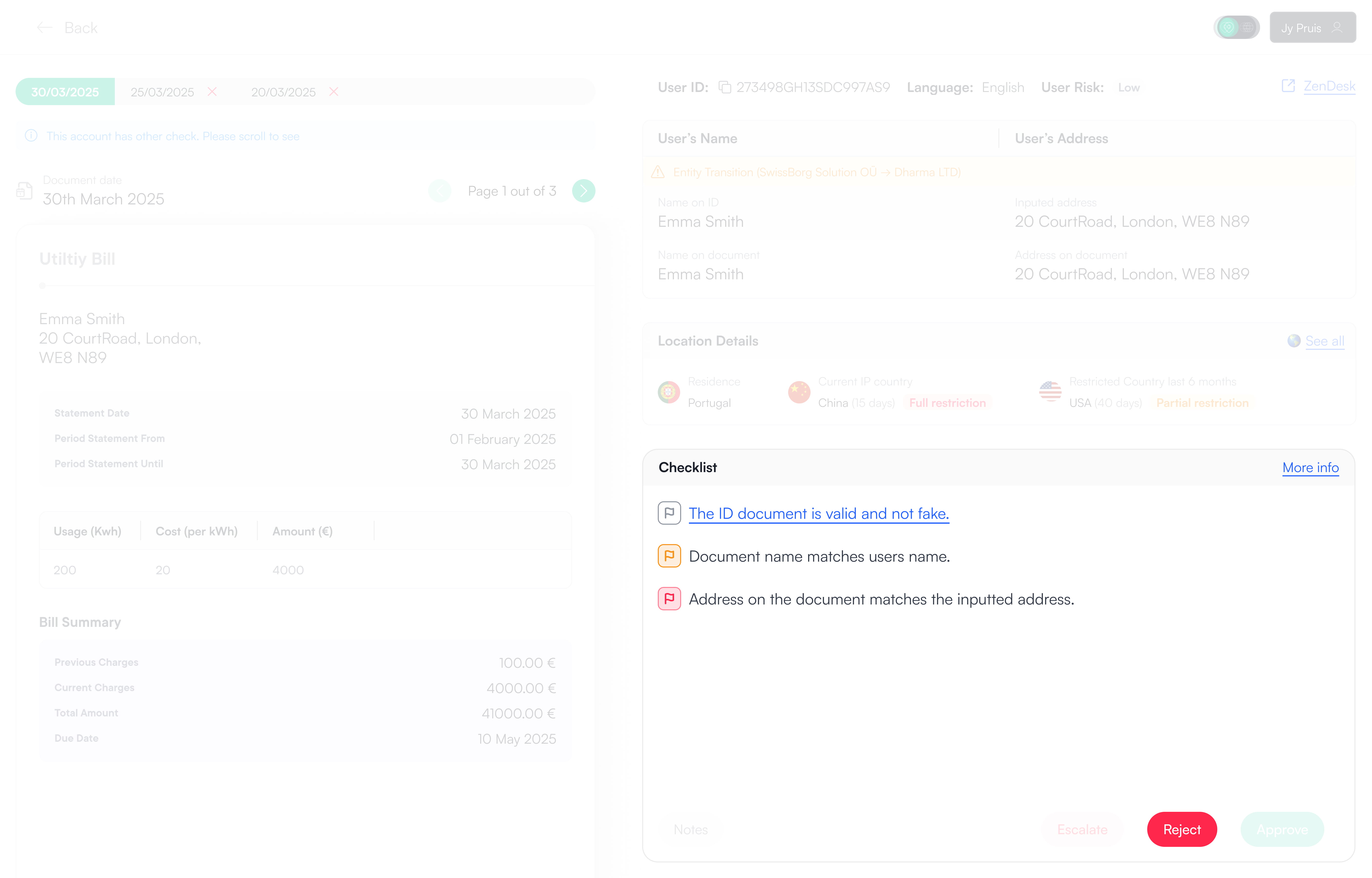
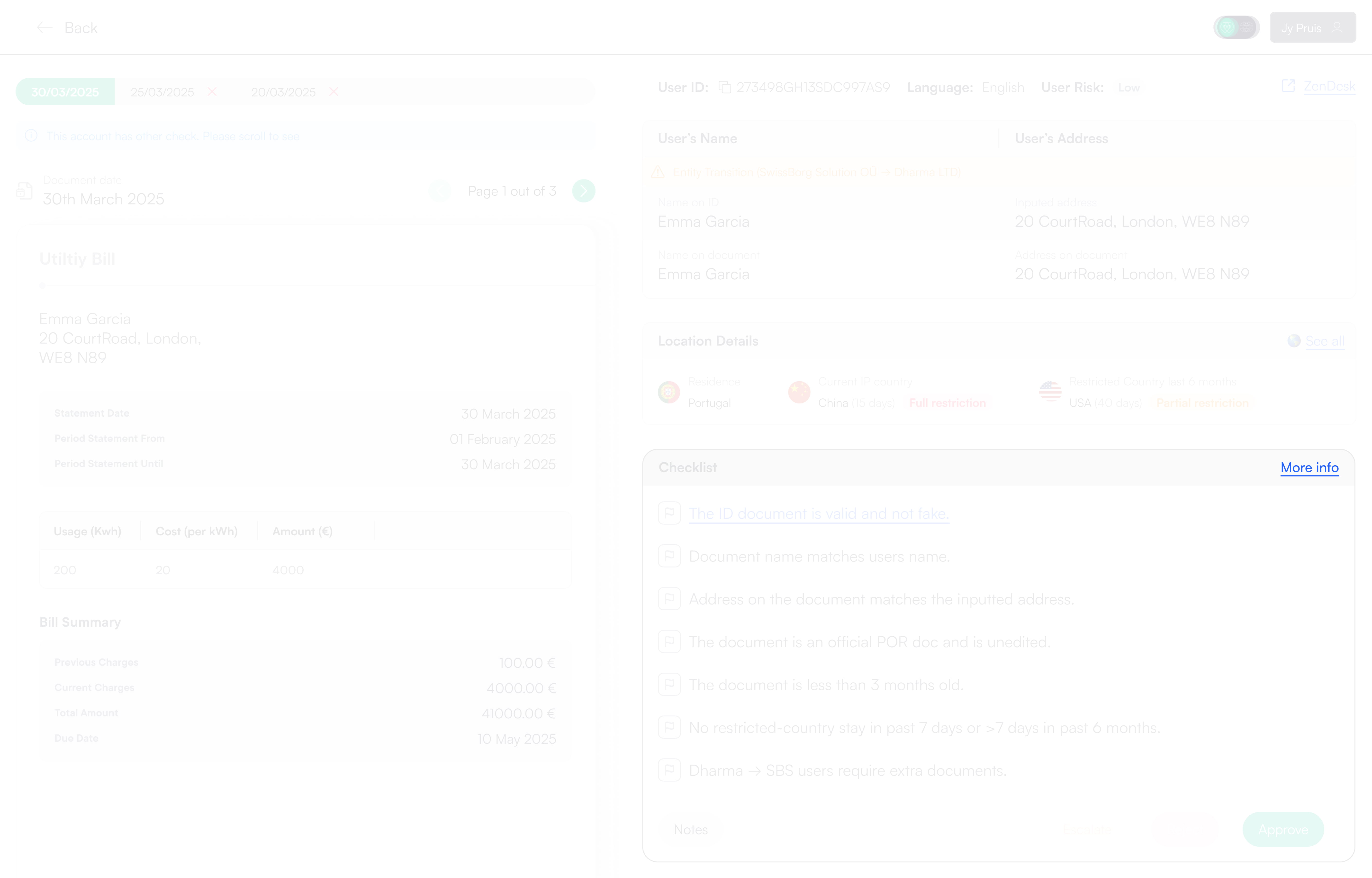
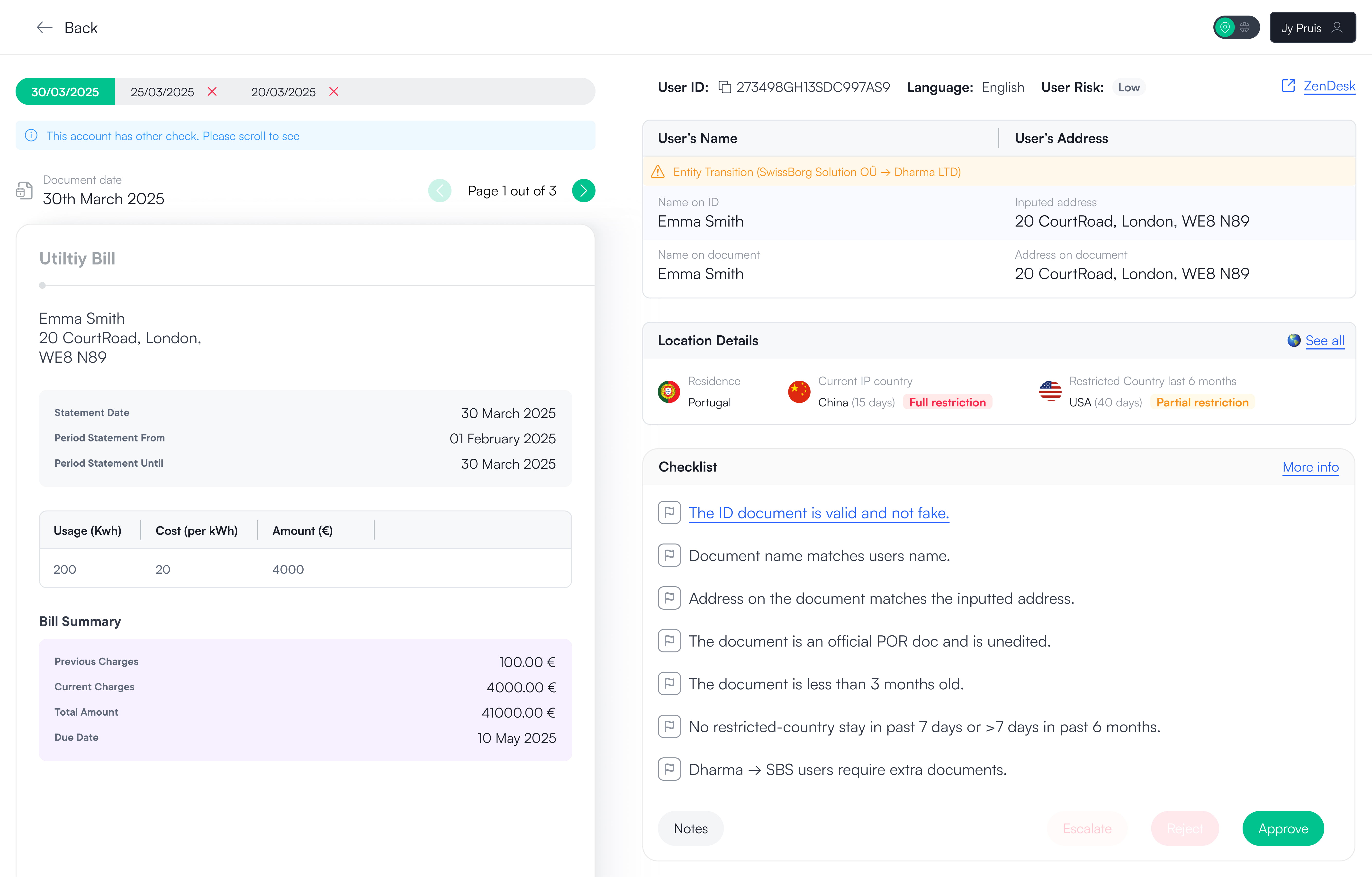
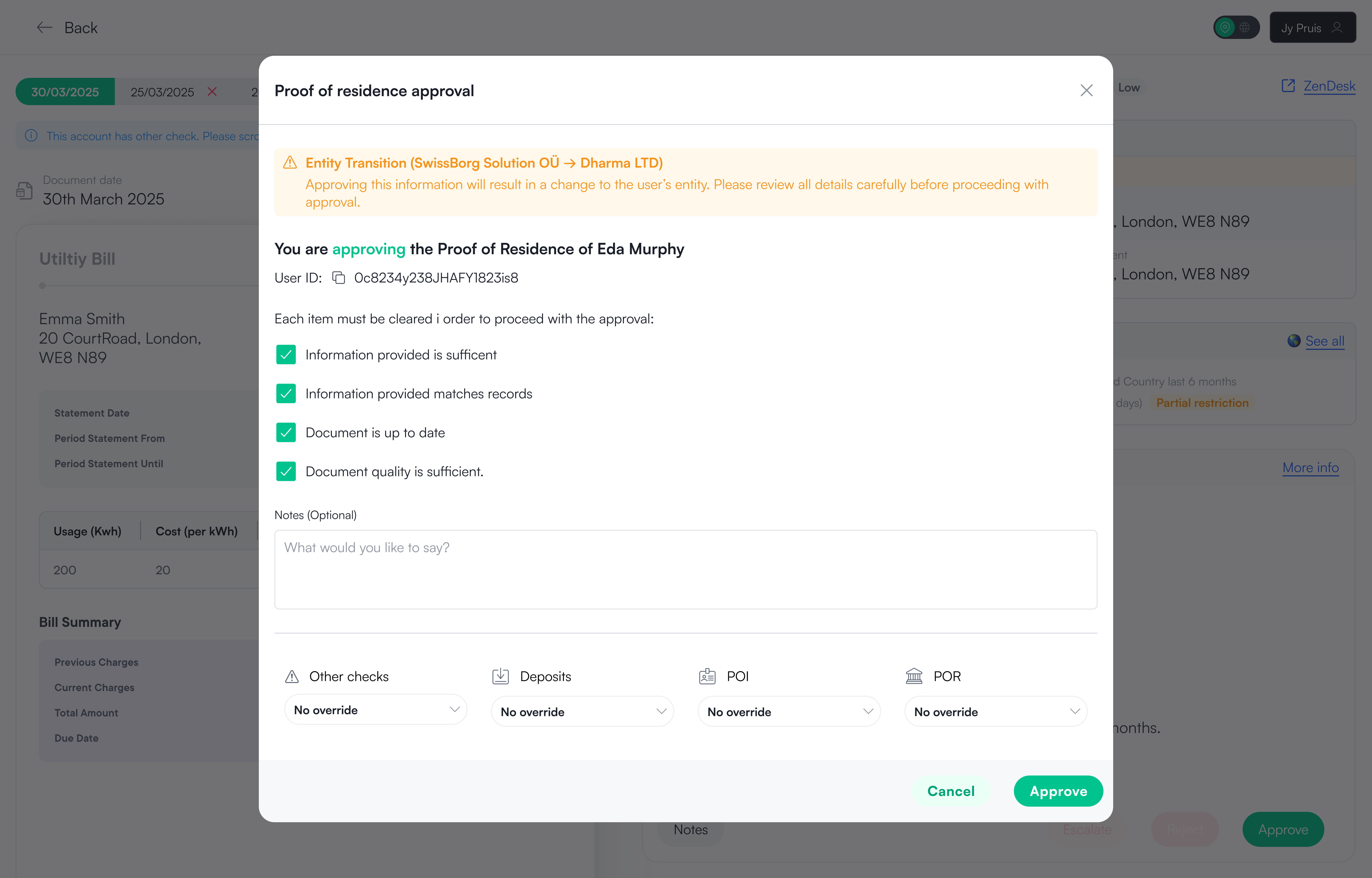
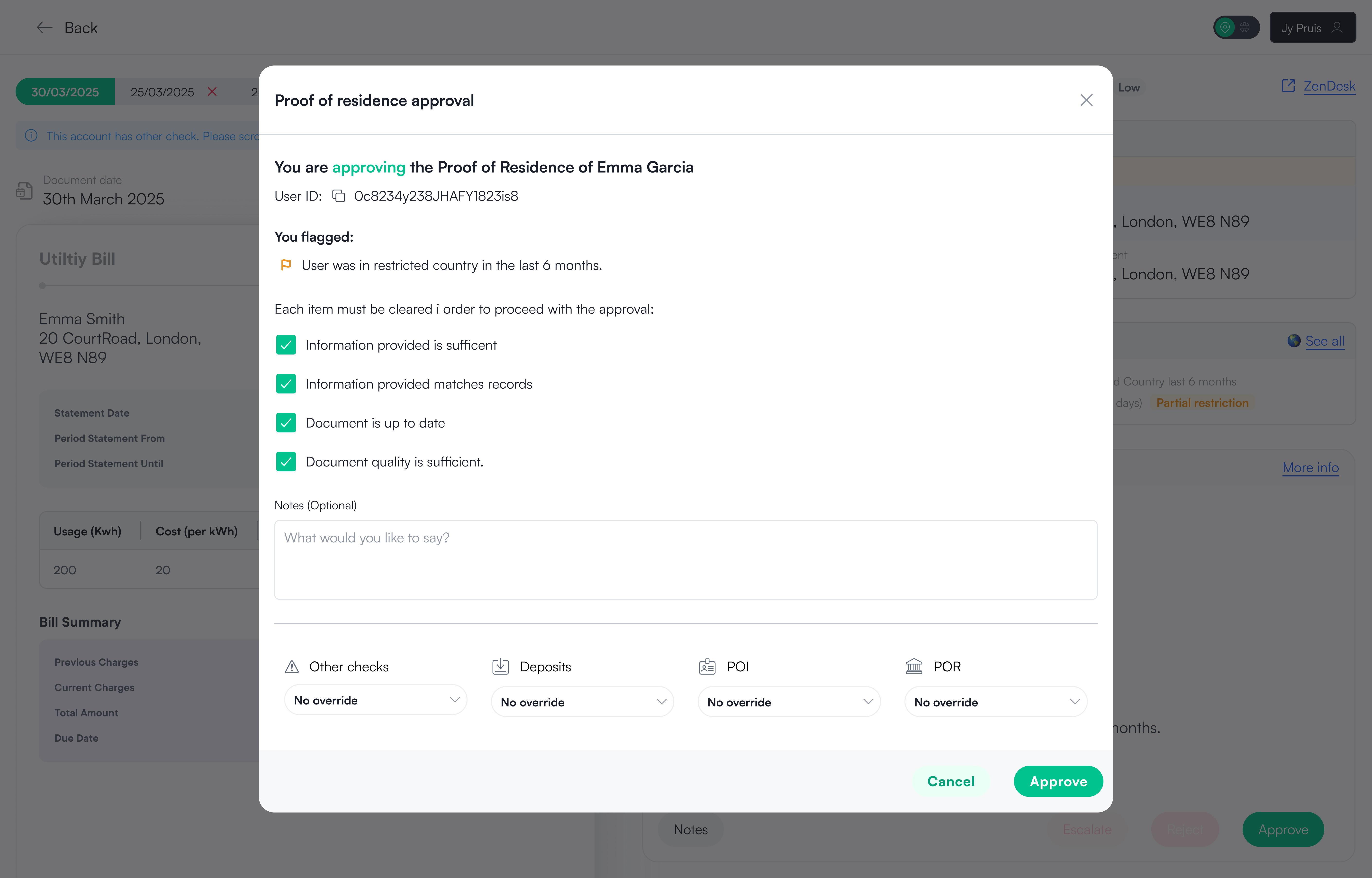
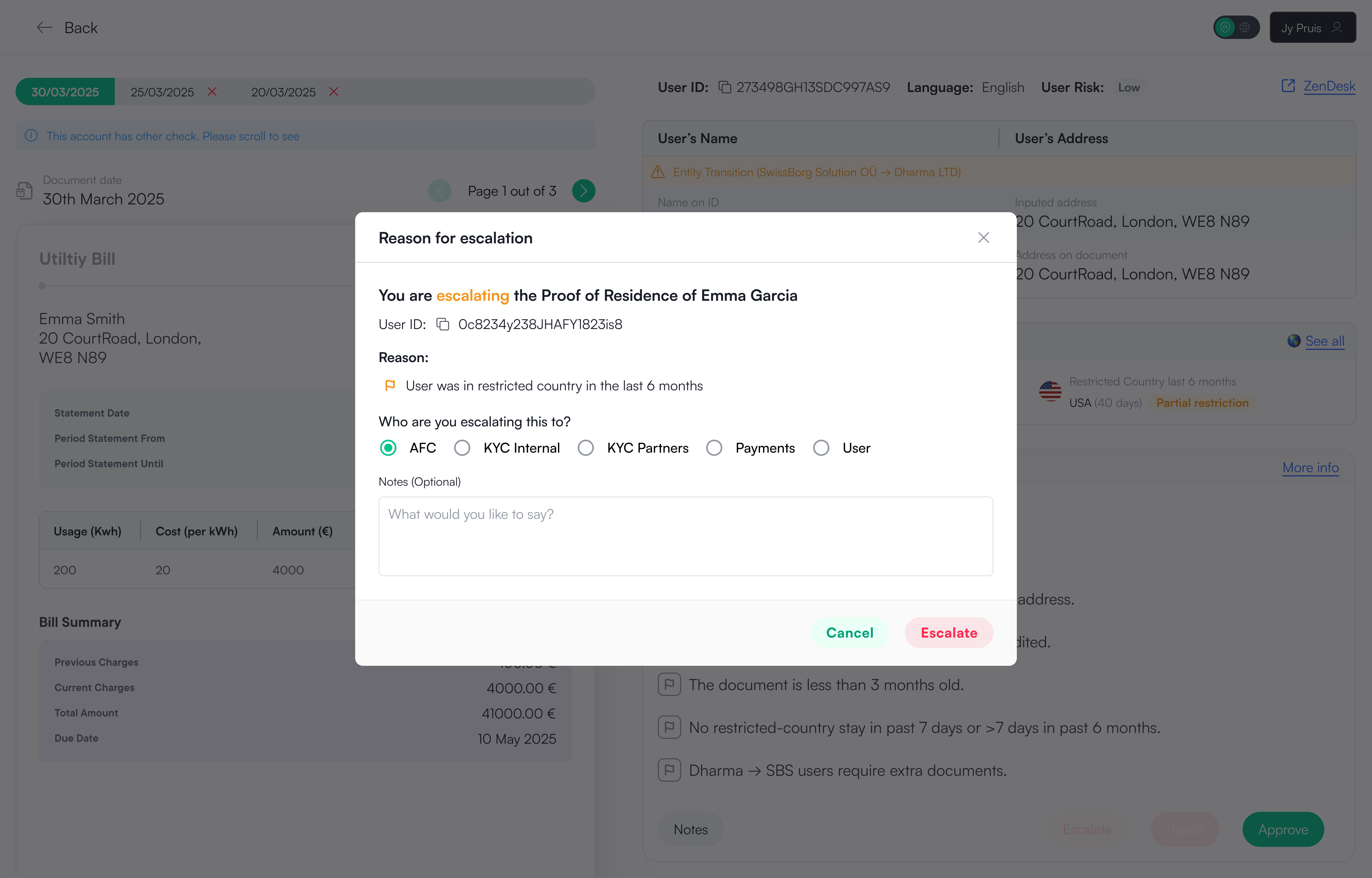
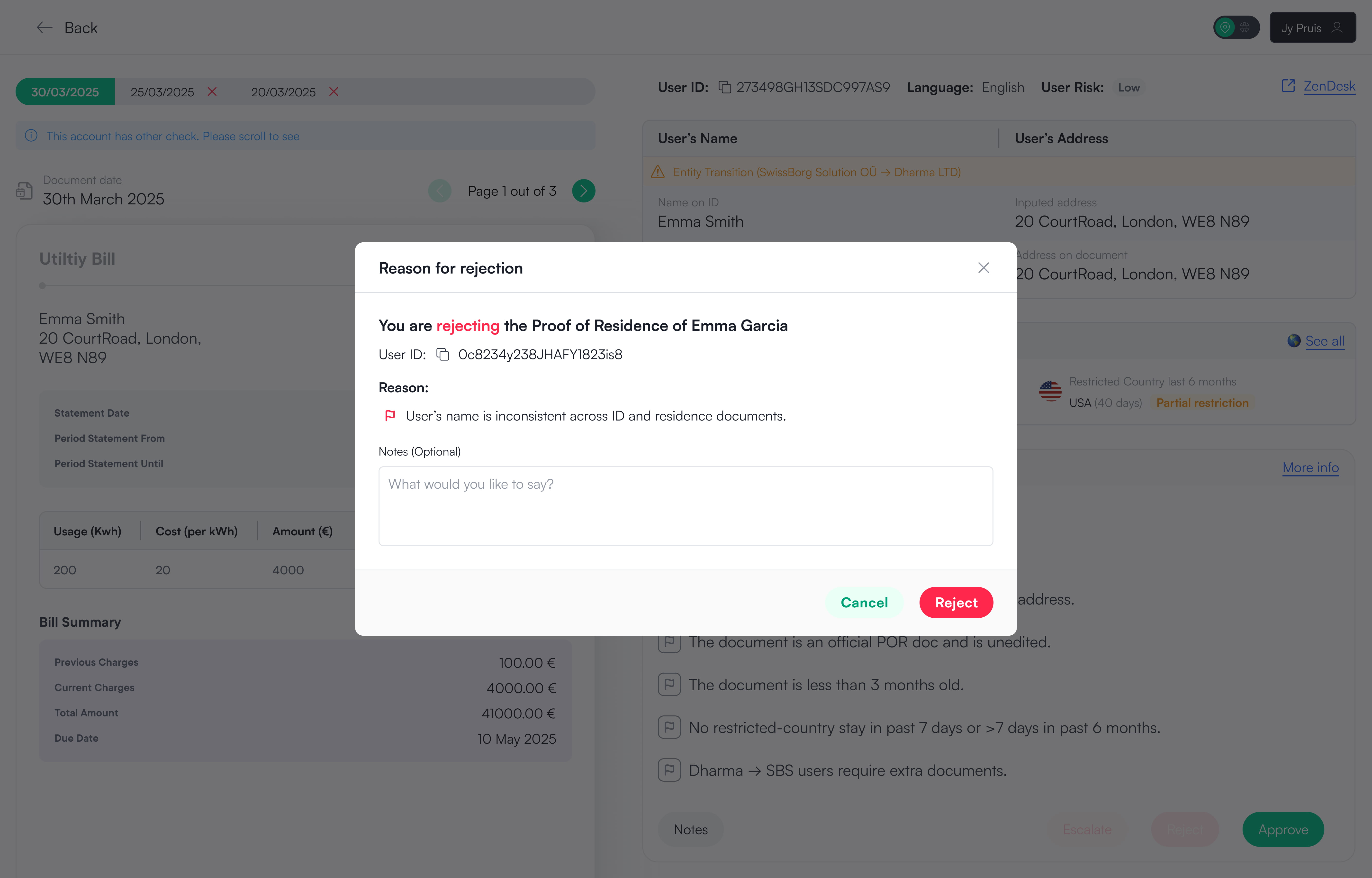
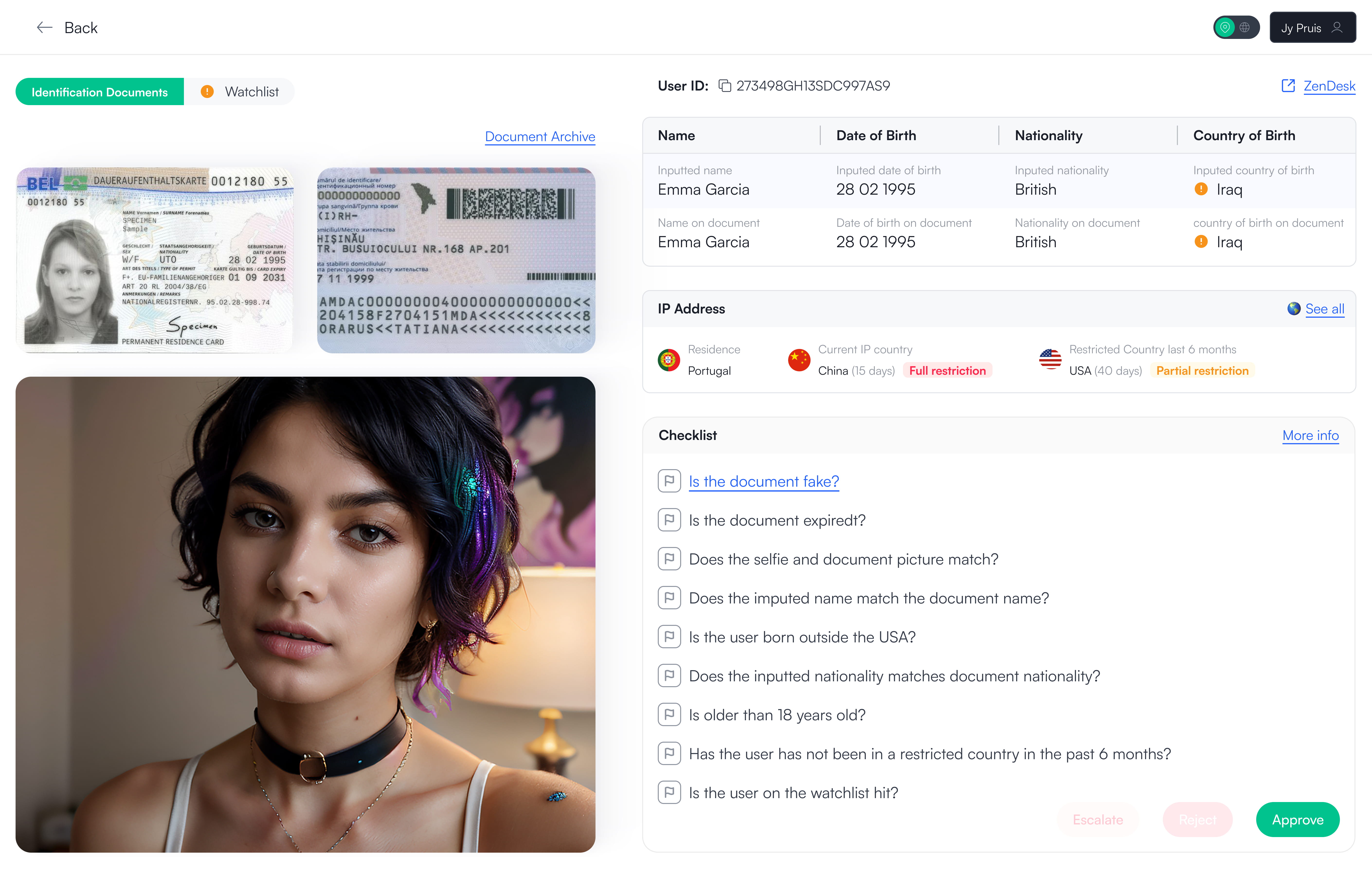
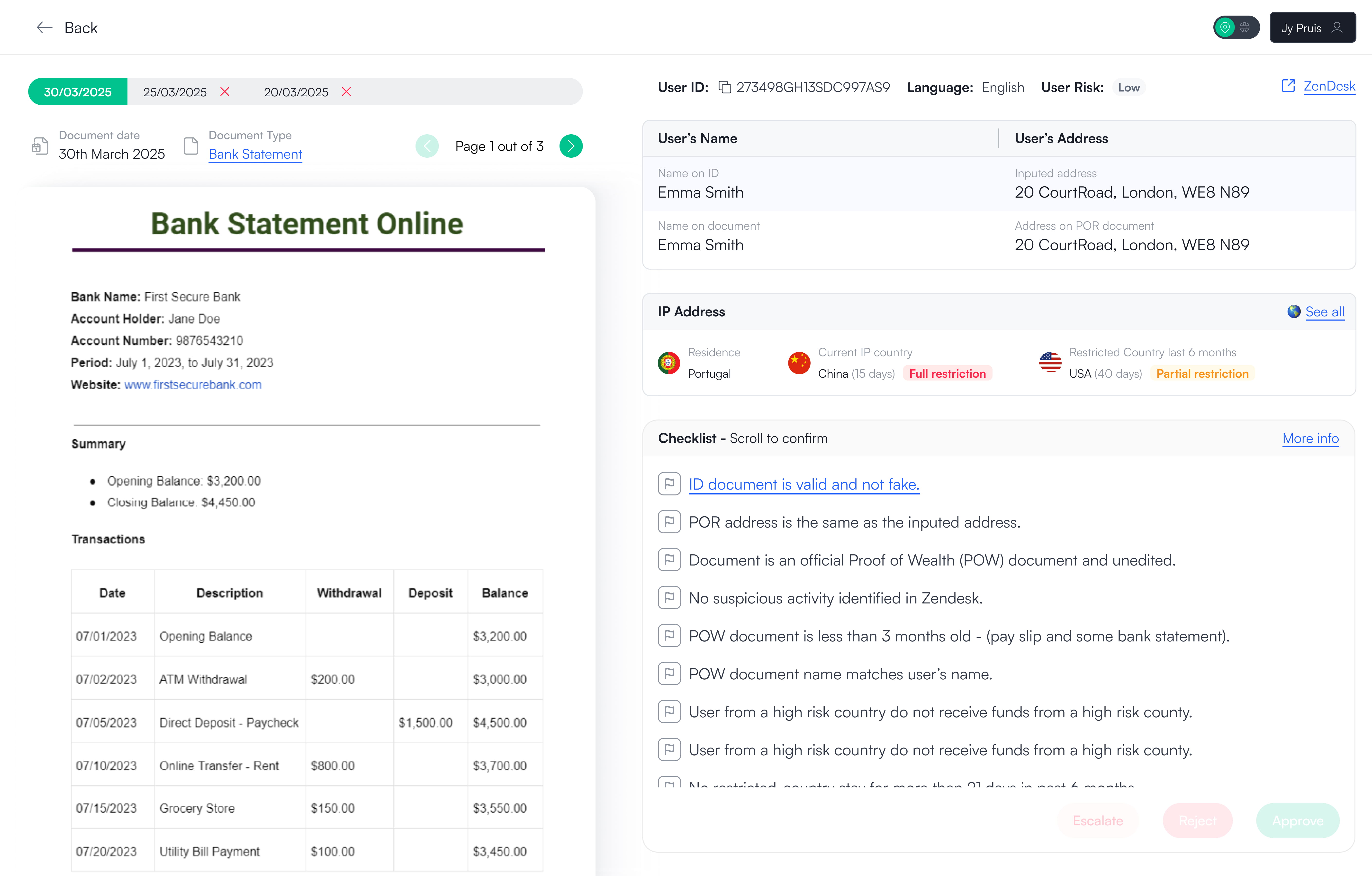
Unfortunately, I no longer have access to the back-office. However, the screenshot above shows how the system previously worked. The interface was extremely long and relied heavily on tabs to separate information into different sections. This required excessive scrolling and constant context switching.

Even though agents reviewed one application type at a time (Proof of Identity, Proof of Residence, or Proof of Wealth), they were still exposed to a large amount of unrelated information. With no clear review order, agents had to decide for themselves what to check next, increasing handling time and slowing down decisions.
Agent work efficiency
Agents weren’t slow because the work was complex.
They were slow because the system made them manage the process themselves
Goals
Redesign the application review experience
Turn a slow, fragmented review flow into a clear, guided process that helps agents decide faster and more consistently.
Lower cognitive load
The implementation of a new feature that allows users to save their filters as views.
Agent review consistency
Introduce a standardised, guided review format across all agents.
Reduce agent handling time
Remove unnecessary scrolling, friction, and redundant steps.
Results
50 - 75% reduction in agent handling time in the first week
By moving from a fragmented, tab-based experience to a single, guided review flow, agents were able to complete Proof of Residence checks significantly faster. The reduction came from clearer structure, less scrolling, and removing the need for agents to decide how to review an application.
Guided, consistent reviews
Agents follow the same structured review order, reducing variance between decisions and lowering cognitive load.
Less navigation, less thinking
All required information is visible in one place, removing tab switching, excessive scrolling, and guesswork.
Faster access for users
Shorter handling times meant users regained access sooner and could return to trading with less friction.
Proof of Residence
The full design of the proof of residence with all the checks and information needed.
Approving Proof of Residence
Here the user is able to approve the application as well as set any limits to the user or leave any notes for future reference.
Approving when flagged
Not every application is as simple as following the checklist. If the agent sees the user has been in a restricted country in the last 6 months that's not a cause to reject but they can flag so other agents know they are aware of this and keep a closer eye on the user.
Escalating Proof of Residence
Here the user is able to escalate the application with reason flagged being shown on the modal. This does not mean the application is rejected but rather the agent might need a second opinion or is not comfortable to make the decision alone.
Rejecting Proof of Residence
Here the user is able to reject the application with reason flagged being shown on the modal. The agent can then add any notes extra they want to keep for reference.
Scalability
Seeing if the template works on other Proof checks
As mentioned above the Proof of Residence design would act as a template to other checks. Designs for Proof of Identity and Proof of Wealth were also done before locking in the final template style for Proof of Residence to see if works for other checks.
Proof of Identity
Proof of Identity is the first application the user has to do before being able to invest at SwissBorg. Here the user uploads of a photo of one of their government documents and a face scan. If the image is too small or does not show the all the information the agent can click to open in a lightbox to view the entire image in full.
Proof of Wealth
Proof of Wealth is the last and final application the user has to do once they reach 50'000 AUM in their portfolio they can not carry on investing until they provide their proof of funds. Here the user uploads a document stating their funds, this can be a pay slip, bank statement, inheritance information etc.
I hope you enjoyed the read so far!
To see the design process and how the design solution came to be, please continue to scroll.
Or feel free to see
other projects
Research
Seeing how agents interact with the back-office
I shadowed a variety of different agents to see how they approve, escalate or reject proof applications.
Cumbersome
Information scattered across multiple tabs
Too much time spent scrolling
Time wasted jumping between views
Too much information shown at once, increasing cognitive load
No easy way to compare related data
Agents completing the same checks in different orders
Hands-on research
My own experience with the back-office
To fully understand the workflow, I spent some time acting as a compliance agent; reviewing, approving, escalating, and rejecting Proof of Residence applications in the test back office. This surfaced confusion. My first thought was: where do I start, and what should I look at first?
My attention was everywhere
I was looking at a Proof of Residence check but I also have to use their Proof of Identity check so I have to go scroll up and down open and close tabs. it was a mess.

Am I doing this correctly?
I felt the back-office was like the Wild West. I was doing what I wanted with no clear instructions what to check, what can pass, what can't pass and ultimately I was figuring this out alone.
Decisions felt risky.
I could complete the checks, but the system didn’t guide or reassure me that the decision was correct, making every approval, escalation, or rejection feel uncertain.
Design Rationale
Key considerations, setting the scope
From my research I sat down with my Product Manager and set the scope. Here Design decisions were driven by one core principle, optimise for decision-making not navigation
In scope
For future release
Flagging and surfacing risk indicators early
Presenting information in a structured, stacked layout
Show Proof of Identity information in Proof of Residence check without needing to scroll
Making approve / escalate / reject actions obvious and contextual
Exploring AI-assisted data extraction as a future improvement
Use the data already available in the back office
Allow agents to write notes on the Proof of checks for other agents to see.
Streamline the approve modal so agents do need to do multiple clicks to check
Use AI to determine if Proof of Funds meets criteria

(this was for KYC 3)
Design rationale
Why designs were produced certain way
Looking into key design aspects of the solution and why they were designed in a specific way.
Allowing the user to flag a check
Agents are quickly able to flag issues. If the flag is yellow agents are able to escalate or approve. However, if one flag is red escalate and approve CTA's are disabled and the agent can only reject. Some flags require two clicks to turn red and some checks like "Address on the document matched the inputed address" would turn red directly as that is a huge compliance security risk if the agent accepts the user and the data is not consistent.
Try it yourself
Click on the flag to go through the different states.
Reject
Reject
Escalate
Escalate
Approve
Approve
Why flags?
I looked into multiple options and landed on flagging. The reason is because in all the other options (there was more than just the ones shown here) They are all a sort of boolean options true false, yes and no. There were multiple reasons I did not agree with this. I wanted the agent to click as little as possible and the other is that even if something is false or something to keep an eye on it, it doesn't classify as a application rejection and having a boolean doesn't have that level of flexibility. Agents also agreed that they preferred the flag-based approach over the others due to the flexibility.
Catering for smaller screen resolutions yet still being compliant
If the agent has a smaller screen resolution the checklist overflows and becomes scrollable. However at the very bottom there is a check the agents must click in order to approve the application as it's compliance for the agents to carry out all the checks. Once the check is checked the approve button will be enabled and the agent can approve the user's application.
Stacked information comparison  
Previously to compare, the agent would have to scroll up see Proof of Identity remember or duplicate tab and then compare it to the information of Proof of Residence. Not a very efficient process. In the new back-office update the agents have all the information is a stacked view so that they can clearly see if there is a mistake in the documents or not. As you can see in the image above it's much easier to see there's an inconsistency in a stacked view vs side by side view.
Agents feedback
The hard truth, Did the agents actually like this solution?
They absolutely loved the design and in the first release they could express how much clearer the process is but old habits die hard. We have disrupted their own individual process they had and pushed them into a guided unified process so some agents were wanting to go back to the previous back office to make sure they can check any other irrelevant data taking such as checking transactions and mobile numbers before making a decision for the user.
Option 1: Ignore them
Agents were constantly changing so once the agents are replaced the new agents wouldn't know there was a legacy back-office. However we did have agents who were employees and not contractors and who have been in the company since the very beginning so one option is to ignore them and they get used to the new guided format of making decisions.
Option 2: Work with the agents
What we did
We sat down with the agents, listened to their concerns, and agreed on a gradual rollout. The new flow was introduced alongside a "More info" link to the legacy back-office, giving agents time to adapt. After one month, the legacy link would be removed, allowing the new experience to become the default without forcing an abrupt change. Something so simple, yet saved a lot of internal friction.
Hand off
Handing off the designs for development
Design hand off was simple and efficient. The designs on Figma were flowed with arrows and wrapped in a section. I kept in constant contact with the web developer and kept track of the build through our stand-ups as well as making necessary changes whenever needed such as an agent coming to me and my product Manager stating that they need to see if the user has swapped from SwissBorg Solutions entity (EU, UK and Swiss) to Dharma (outside EU).
Reflection
My thoughts on this project
This project reinforced how often performance issues are framed as people problems when they are actually system problems. Agents didn’t need more training or stricter rules, they needed a system that guided them through the work instead of making them manage it. There were many constraints but I realised for this epic designing internal tools meant optimising for clarity, consistency and decision-making.

I am extremely proud of my team and myself for reducing the time agents take to make a decision on a proof application by over 50%. This had to be done quickly and efficiently as we did not want to spend too much time on internal upgrades.

If taken further, I’d explore deeper automation around data extraction and risk flagging, but only once the underlying structure is solid and proven to scale.