Designing a dashboard to manage hospital's filters and indicators, potentially saving lives. All whilst optimising the configuration department, removing stress on the developing team.
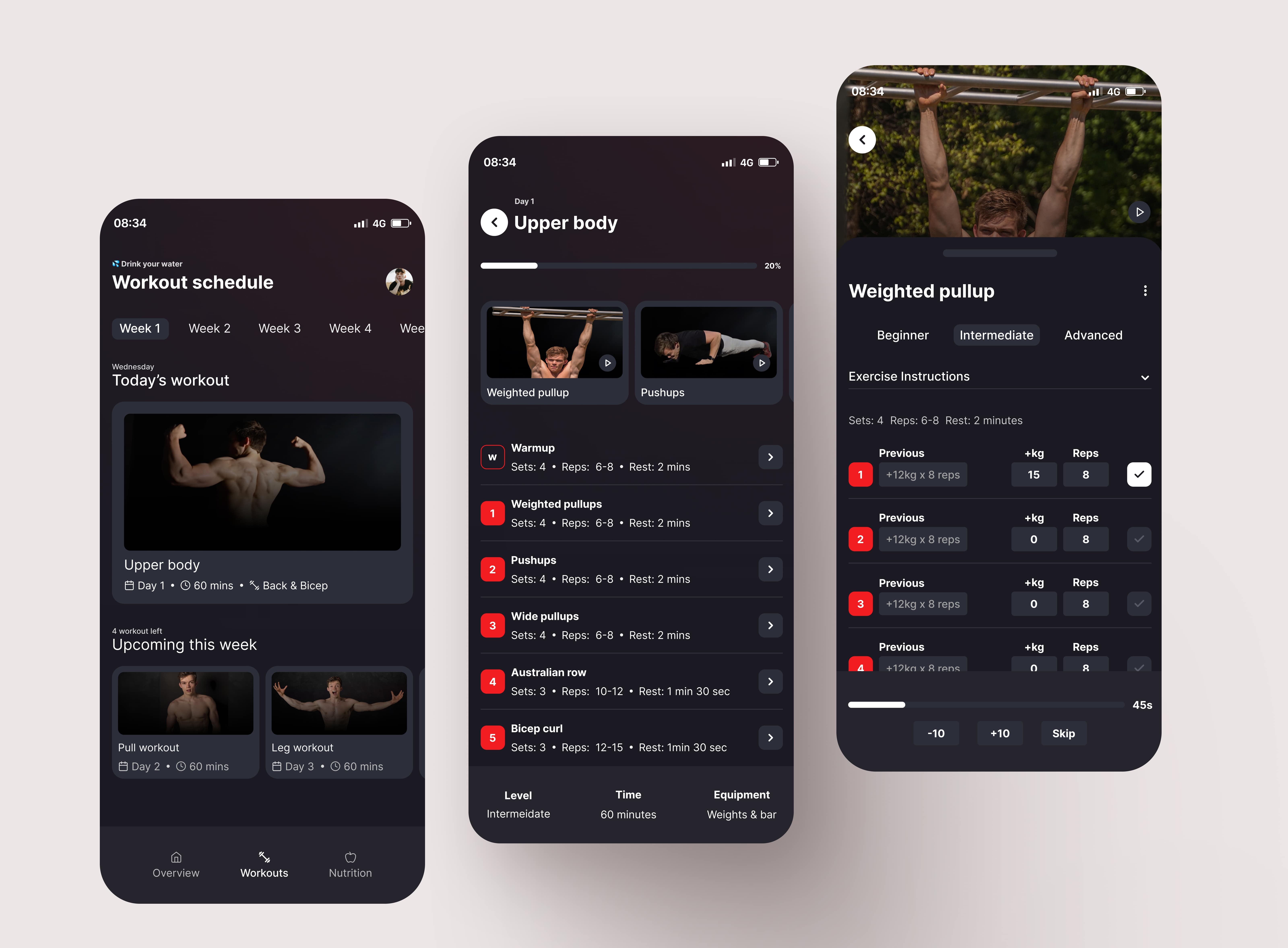
Three tickets combined into one epic, addressing usability issues, user needs, wants and pain points. Converting the Period page into a personalised experience.
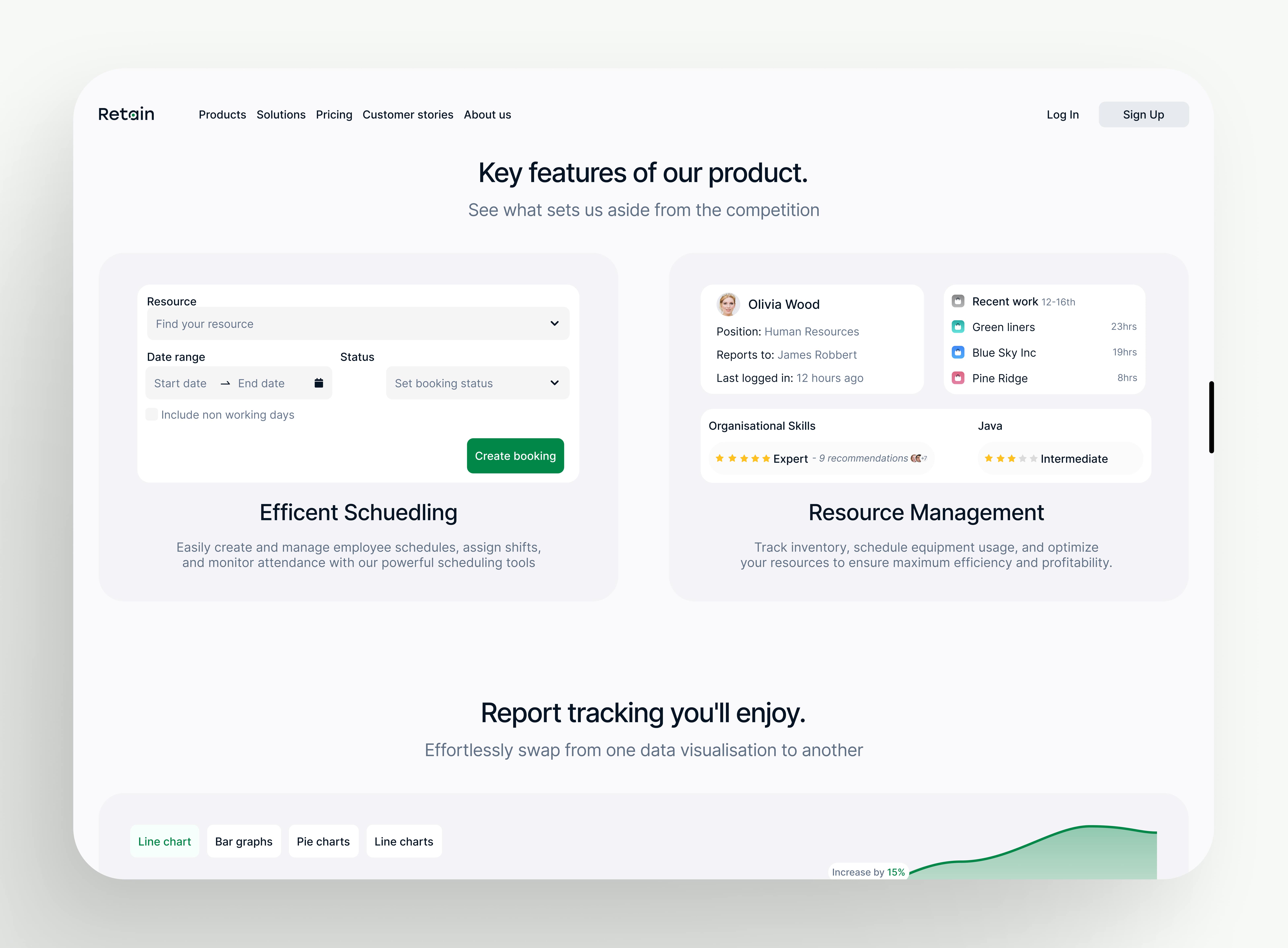
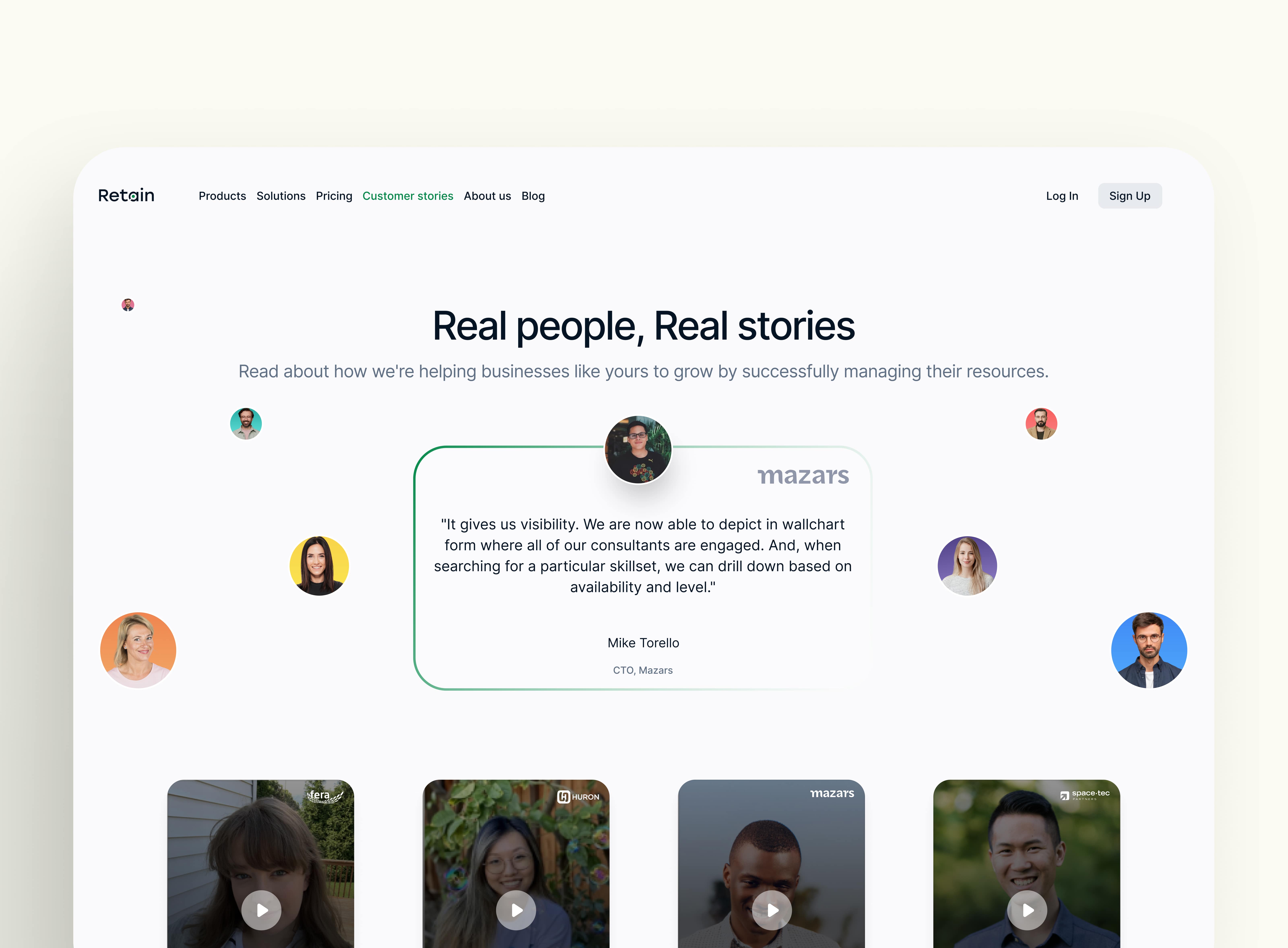
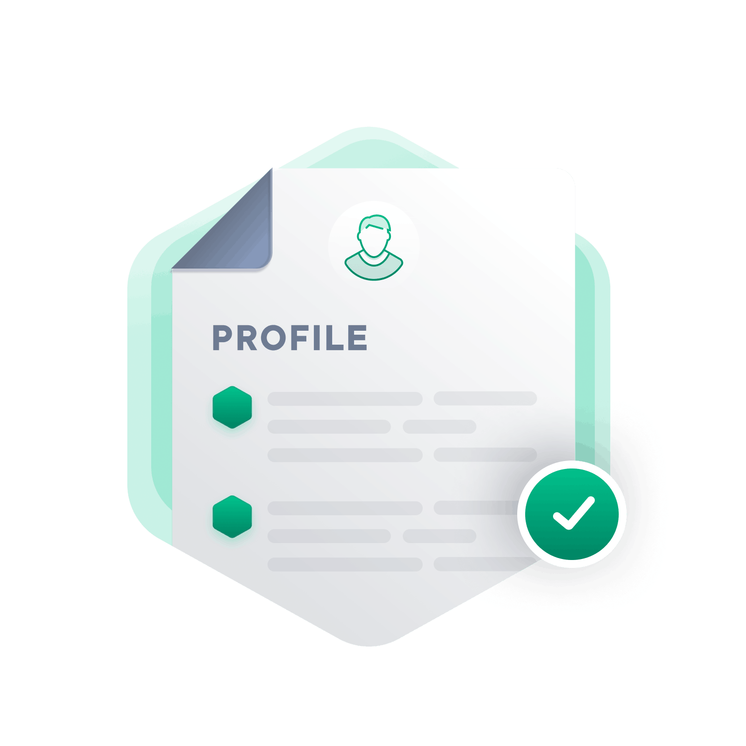
Rebuilding and rebranding Retain's entire design system from scratch across mobile and desktop platforms, prioritising AA accessibility standards.
tRY OUT THE PROTOTYPE below..
Layers
Assets
Pages
🅰️ Typography
🌈 Colours
💠 States
Colours
Primary/100
Primary/200
Primary/300
Primary/400
Gradient/100
Gradient/200
Gradient/300
Gradient/400
How to use
Color is a foundational element within any design system, audiences. Thus, color becomes a dynamic force driving engagement and shaping user experiences within the digital landscape.
States
How to use
Empty states serves a multitude of purposes that are vital for enhancing user experience. Beyond being mere placeholders for content, they act as guiding beacons and offers users direction.
Typograpy
How to use
Typography plays a pivotal role within design systems, serving as the backbone for brand identity, readability, and visual hierarchy. Through careful selection of fonts, sizes, spacing, and styles.
Designing a dashboard to manage hospital's filters and indicators, potentially saving lives. All whilst optimising the configuration department, removing stress on the developing team.


.png)


.jpg)
.jpg)
.jpg)
.jpg)