Tax Systems is a UK company offering tax compliance software. Specialising in digitalising and modernising tax processes and prioritising data security through their desktop cloud applications.
What this case study looks into
Tax Systems has received numerous reports citing inefficiencies in using the period page within its cloud application. This case study investigates a usability overhaul of the period page, focusing on addressing three key issues: saved filters, filter space, and table usability to enhance user experience.
"Looks really good, best solution."
- Retain user tester
My role
UX/UI Designer
UX Researcher
Team
Product Owner
Mobile Developers (2)
Line Manager (2)
Time frame
4 weeks
Tools
Figma
Microsoft Teams
DevOps
Tower
Alright, I got all my filters set up! aaannd wait.. Where'd they go??
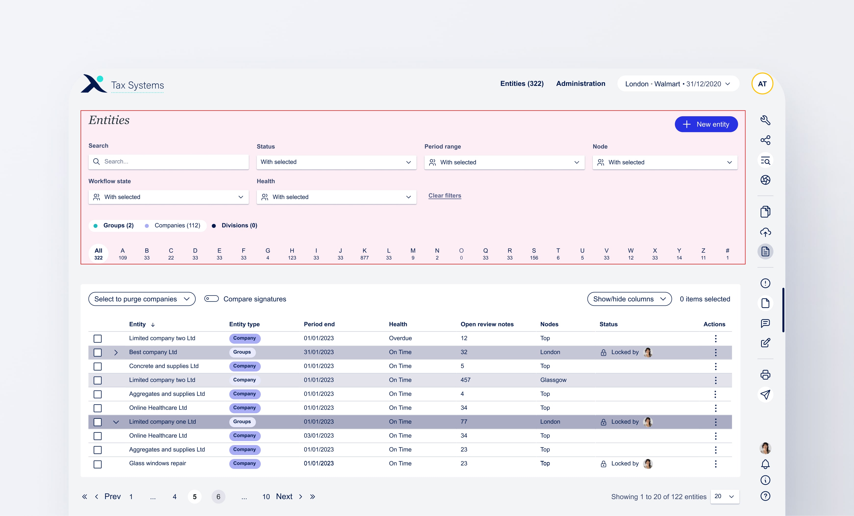
Period page
What is a period page?
A period page is a section in the application where users can view and manage information related to their groups and companies, including financial data, reports, and other relevant details for specific time periods.
Context
My contribution & responsibilities
As the UX/UI designer, I improved the period page user experience by simplifying filter saving, adding dashboard views, and prototyping solutions like fixed-scroll tables. I led design workshops, collaborated closely with stakeholders, and managed the hand-off to development, despite resource constraints.
Constraints
Epic limitiations
No offical user testing
This 2-week epic included three tickets, covering research, ideation, development, PM and BA confirmations, workshops, design, and a full prototype. I also led team feedback sessions to demonstrate the process from concept to completion.
Future release issues
Key features that I believe would have solved the user issues properly have not been made live or are not yet planned in the road map to be developed as of yet due to budget and resources. Hopefully, when its's being picked up again there'd be time to test.
Problems statement
Tax Systems has received user frustrations regarding reapplying their filters each time they enter the period page and not having set filters. Additionally, Users have expressed their concerns regarding the filter section occupying too much space, hindering their availability to view the table. The table itself has also received complaints.
Filters not remaining applied
Unfortunately having multiple dashboards with different saved filters applied did not make the first release. I see huge benefits to managing views where a user can share dashboard views with another user. Whilst Tax Systems templates could speed up the on boaridng process for new users and customers.
Filters occupying too much space
The above screen shows just how much space the filters utilise, taking the top 40% in the design. (Depending on user's screen size this might be slightly more).
Table issues
Pagination, does not stay fixed, table headers do not remain sticky.
Goals
Revamp the period page
The main objective would be to address all user frustrations, looking into saving filters and implamenting views, reducing filter space and enhancing the table usability.
Saved dashboard views
The implementation of a new feature that allows users to save their filters as views.
Filter inefficiency
Offering our users the ability to set their filters but not constantly have to see all the filters.
Table enhancement
A better user experience when interacting with the table by fixing table headers.
View considerations
Exploring Views: Origins and purpose
User frustration of filters not remaining when leaving the page is not a reason to implement a new view feature as it can be fixed with code. However, looking at user behaviour filters reseting is just the tip of the iceberg as there is a bigger need for views than initially expected.
Prepares
Prepares are known to use filters most. They typically go from filter to filter, typically the same filters are applied.
Reviewers & management
These users don't typically visit the period page much but they tend to have the same filters when they do.
Adding more filters
Tax Systems is looking to add more filters, for more granular filtering. Allowing users to save applied filters would be key.
Filters considerations
Why were removable filters not in this relase?
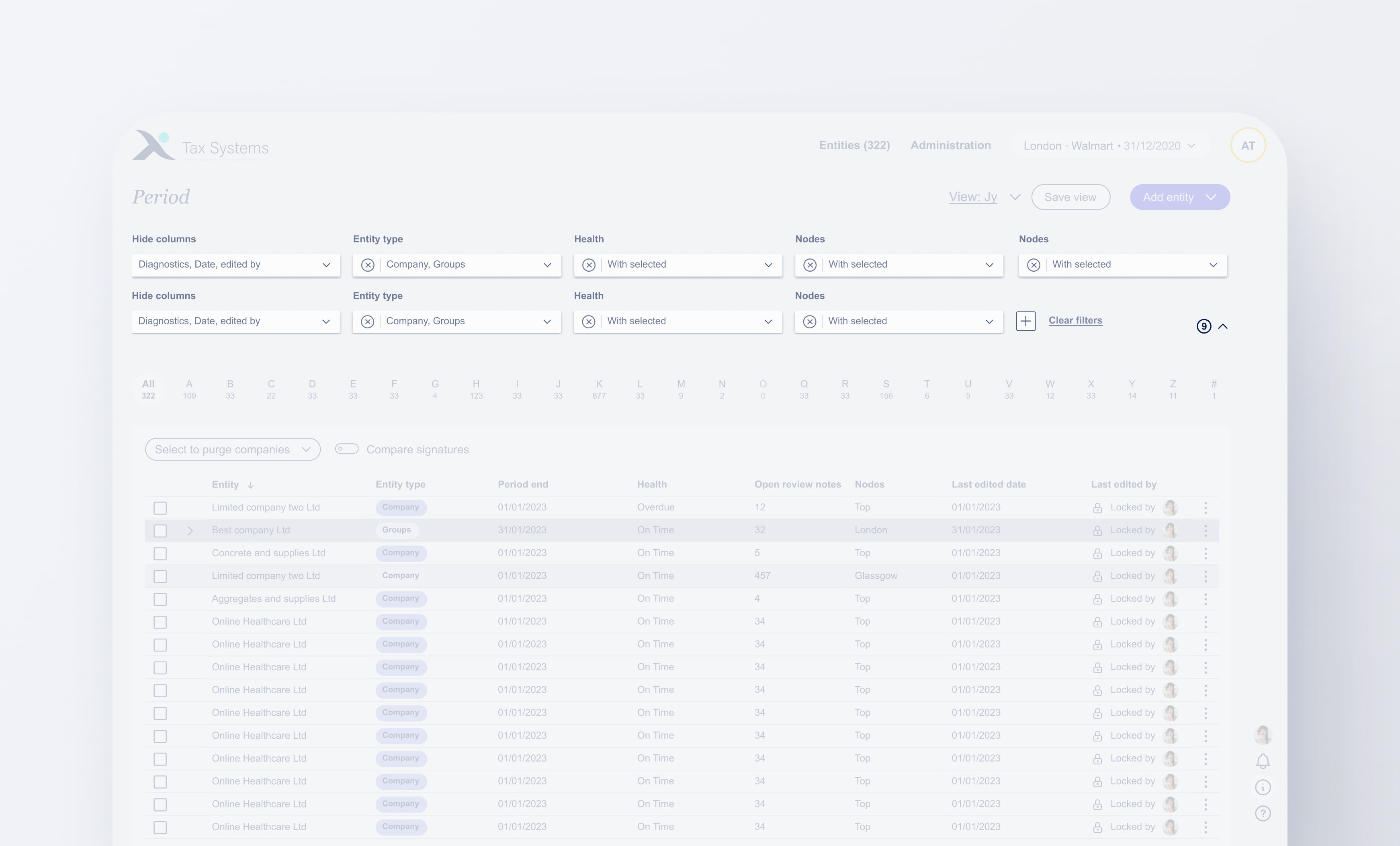
As a team we had to decide what features can be implemented quickly to address our user concerns. Whether we released removable filters or not really made no difference in the space that filters occupied as they were to be collapsed. and only take full heigh when the filter section is uncollapsed, sort of like an accordion. Therefore, it doesn't make a difference if the user has 4 filters or 20 filters there will always be at least on filter showing in the row taking that row of space.
Table considerations
Why was this table design chosen over the current one?
I looked into and prototyped two different types of table user experience; Table where it fixed, and one where the table scrolls with page (what was already on the platform). I then looped in my team to gather their feedback on which they preferred.
Entire page scroll
Great, as the user has full view of table but if the user is showing 200 rows. That's a lot to scroll back up to change filters.
Table fixed scroll
The table is what scrolls so the filters at the top remain at quick access. However, there's a sacrifice in how much of the table data is visible.
Combining both to get the best solution for our problem
Page scroll, sticky filters
Great, as the user has full view of table but if the user is showing 200 rows. That's a lot to scroll back up to change filters.
Results
An efficient period page experience
Even though there some key functionality features that need to be implemented the period page is much more efficent. The implemented design solution that allows the user to seamlessly transitions from one dashboard to the other with a few clicks all whilst saving filter space making it future adapatable should we add mor columns and filters. The table itself is much more useable aswell tailoring to users needs wit changing filters with ease.
Personalised experience
Users can set their own filters and save their own dashboard.
Efficient filtering
Lots of time saved as users don't need to apply the same 8 filters.
Streamlined period page
The user now sees 40% more table data that previously.
taxsystems.com
Customer: Jy
Workflow
Periods
Admin
Periods
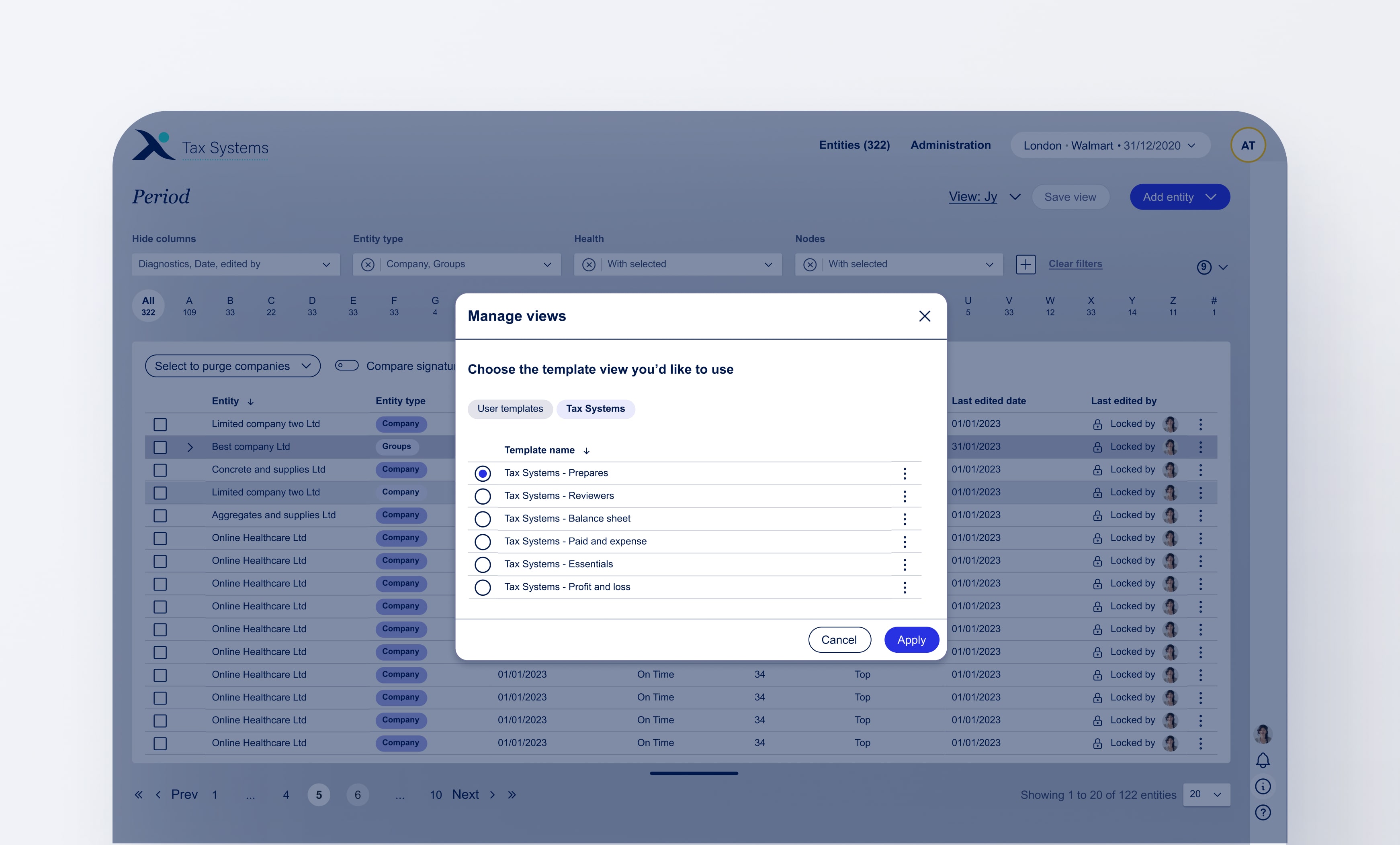
View:
New view
Default
2019 G
View:
Default
New view
Save view
Add entity
Entity seach
Search here...
Hide columns
Node
3 hidden
Showing all
Period end
2024
2019-2020
All dates
Health
Showing all
Showing all
On time
4
Period end
None
Period end
None
Period end
None
Period end
None
Clear all
8
A
82
B
59
C
12
D
45
E
90
F
120
G
118
G
118
H
3
I
89
J
11
K
63
L
22
M
9
O
32
P
103
Q
0
R
20
S
65
T
118
U
3
V
15
W
29
X
2
Y
72
Z
8
#
39
Select action
Entity name
Period end
Entity type
Health status
Locked status
Jy LLC
27/01/2024
Company
On time
Locked by
Apex Fort
05/02/2024
Group
At risk
Efiling
Elara LPC
23/02/2024
Group
Overdue
Locked by
Glyptons
18/03/2024
Company
Overdue
Locked by
Nexis Bark
09/04/2024
Company
On time
Locked by
SL
Cobalt inc
27/04/2024
Company
At risk
Efiling
Vanguard
30/04/2024
Group
At risk
Locked by
Stark Spire
08/05/2024
Company
On time
Locked by
Quant LLC
02/06/2024
Company
On time
Locked by
RG
Entity name
Period end
Health status
Google
03/03/19
On time
GrubHub
20/05/19
On time
Git Lab
08/07/19
On time
Groupon
14/09/19
On time
Garmin
27/11/19
On time
GoDaddy
27/04/2024
On time
Gannet
30/04/2024
On time
Gillette
08/05/2024
On time
Gilead
02/06/2024
On time
Entity name
Period end
Entity type
Node
Health status
Locked status
Jy LLC
27/01/2024
Company
Top
On time
Locked by
Apex Fort
05/02/2024
Group
Top
At risk
Efiling
Elara LPC
23/02/2024
Group
Top
Overdue
Locked by
Glyptons
18/03/2024
Company
Top
Overdue
Locked by
Nexis Bark
09/04/2024
Company
Top
On time
Locked by
SL
Cobalt inc
27/04/2024
Company
Top
At risk
Efiling
Vanguard
30/04/2024
Group
Top
At risk
Locked by
Stark Spire
08/05/2024
Company
Top
On time
Locked by
Quant LLC
02/06/2024
Company
Top
On time
Locked by
RG
Prev
1
...
3
4
5
...
10
Next
Save view
What would you like to call this view?
View name
Enter view name here
New view
Cancel
Save view
Try it out for yourself!
Save a view and swap between dashboard views.
Adding your personal view
User simply needs to set up their view, press save and input their custom view name.
Changing views from pesonal to default
With a few clicks the user can go from one unfiltered dashboard to their personal filtered another
Renaming your personal view
As simple as when you first named it.
Resaving your personal iew
When a feature is changed
Opening and hiding filters
How the filter section functions now to acomodate more space for the table view.
OMITTED FEATURES
Features that got designed but were put on hold
As mentioned above due to lack of time, money and resources what has been released to our users is an MVP, meaning saving one dashboard and resaving that dashboard at the users expense of needing to change filters.
Managing multiple views and offering Tax Systems template
Unfortunately having multiple dashboards with different saved filters applied did not make the first release. I see huge benefits to managing views where a user can share dashboard views with another user. Whilst Tax Systems templates could speed up the on boaridng process for new users and customers.
Opening and hiding filters
How the filter section functions now to acomodate more space for the table view.
I hope you enjoyed the read so far!
To see the design process and how the design solution came to be, please continue to scroll.
Debrief of the tickets: Key insights from the BA's
As this was 3 tickets in 2 weeks I needed to run as much information as quickly and as shortly as possible. To do this I looked at the core issue, the opportunities and features needed.
More data to see at a quick glance
More data to see at a quick glance
Looking at adding more filters
Filters take too much space
Time consuming to constantly change filters
Admin wont use the Period page much, if not at all
They tend to filter through the alphabetical filtering.
3 types of users: Prepares, reviewers & admin
Users need to input same filters over and over again
Table usability annoy the user
Ideally, offer tax templates
Filters only affect the table
Prepares bounce from filters to filters
Table usability annoy the user
User research
Looking at the user's needs, wants & pain points.
From the initial call with the BA's I produced user necessities and frustrations based on the key insights spoken about.
Needs & wants
• Change multiple filters at once. • Go back to the same filters they once applied. • Save time without need to reply filters again. • Hide filters they don't want to use. • See as much table data as possible. • Quickly interact with filters.
Pain points
• Filters get removed when leaving the Period page. • Having to scroll more than necessary as filters take 60%. • Scrolling all the way down to get to the table pagination. • Seeing all the filters they don't need or not in use. • See as much table data as possible. • Quickly interact with filters.
With all that being said..what can be done to achieve user goas?
Proposed ideas
Dashboard views: Create views, save filters, quickly swap from different applied filters to filters.
Persist filters: Keep filters when going into an entity leaving Period page.
Remove hide filters: Removable and addable filters to make the filter section less bulky, expanding and hiding the filter area so no matter if there are 4or 20 filters applied, if the section is hidden only 4 filters are taking space with there remaining 16 being hidden until expanded.
Design workshop
Dashboard & filters workshops
I ran a workshop with BA's to see what arethe main features needed. Splitting it between essentials, nice to haves (next release) and not needed.
Essentials
Nice to haves
Not needed
See other user's views
Share the view
Save current view
Set a default view
Hide & show filters
Sectional hide filters
Favourite views
Save filters when leaving Period page
(Dev code)
Multiple views
Delete view
Quickly swap views
Duplicate view
Edit view name
Remove & add filters
Offer Tax Systems template
Have a blank Alpha CT view
Implement dashboard views
Wireframes
Where would the dashboard views live?
I experiment with two different ideas for the location of the dashboard views; the right hand pane and the Period page dropdown. Looking into how the users would interact with the platform when changing their dashboard views.
Option 1: Right hand pane (RHP)
Ultimately, it wasnt the best place to postion the views in the RHP as there was a pssibilty the user could beconfused as when a user enters an etnity they have another RHP with many more tools. So it would look like there would be two RHP's one for the Period page and one for the entity computation.
Oppurtunity of this idea
In the future, if there are other features that need to be implemented into the period page then this idea might get looked into again. For now, there are no major feature implementations for the the Period page in the Roadmap.
The chosen solution: Period page dropdown
Having a dashboard view sitting on the period page would be easier to access and in a closer proximity to the "save view" button to save filter changes. With a dropdown showing recently used views, users are also able to swap between views. Once the multi dashboard functionality is released his would be really useful for the users to swap with ease.
Design rationale
Why designs were produced certain way
Looking into key design aspects of the solution and why they were designed in a specific way.
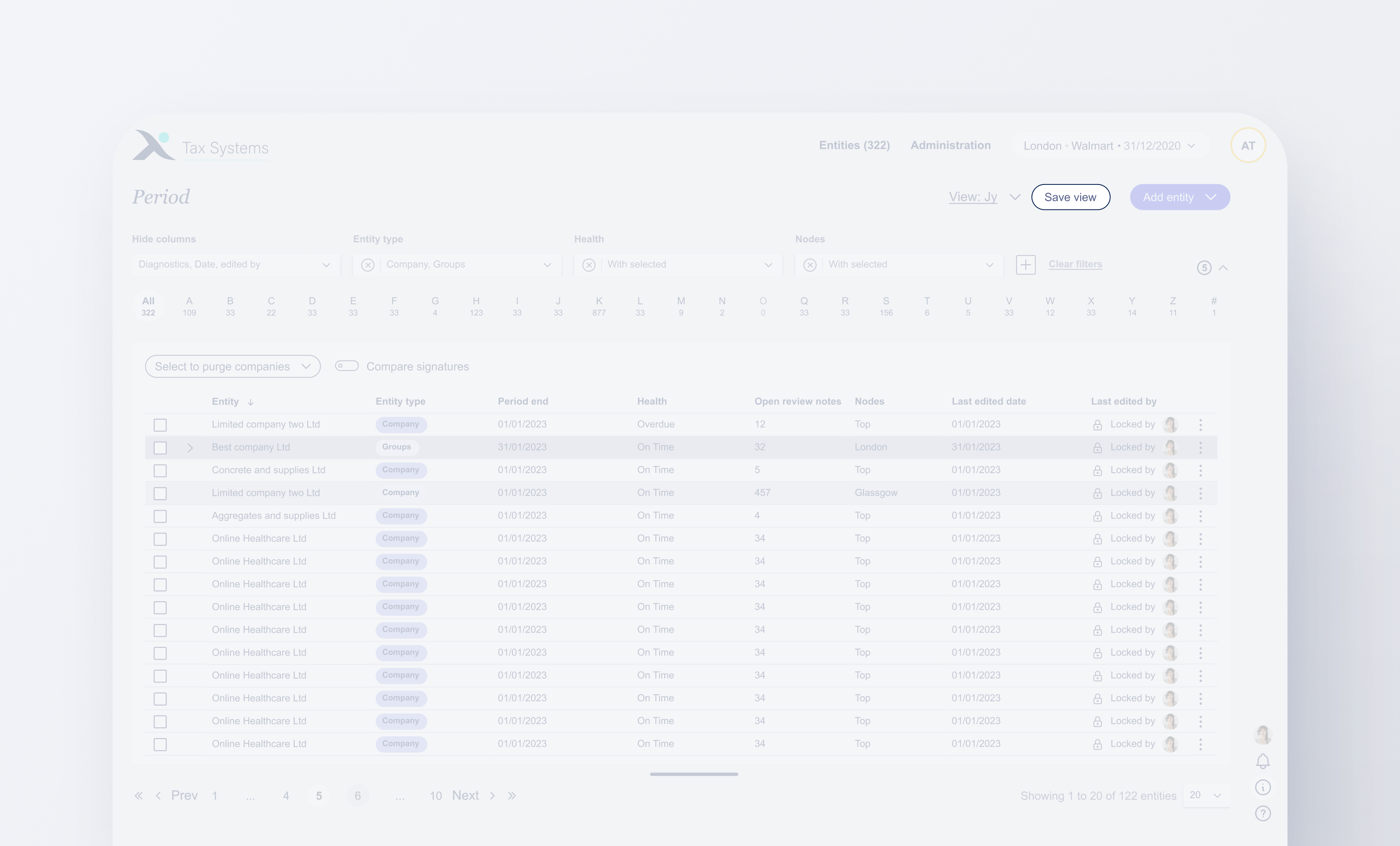
Collapsable filter indicator
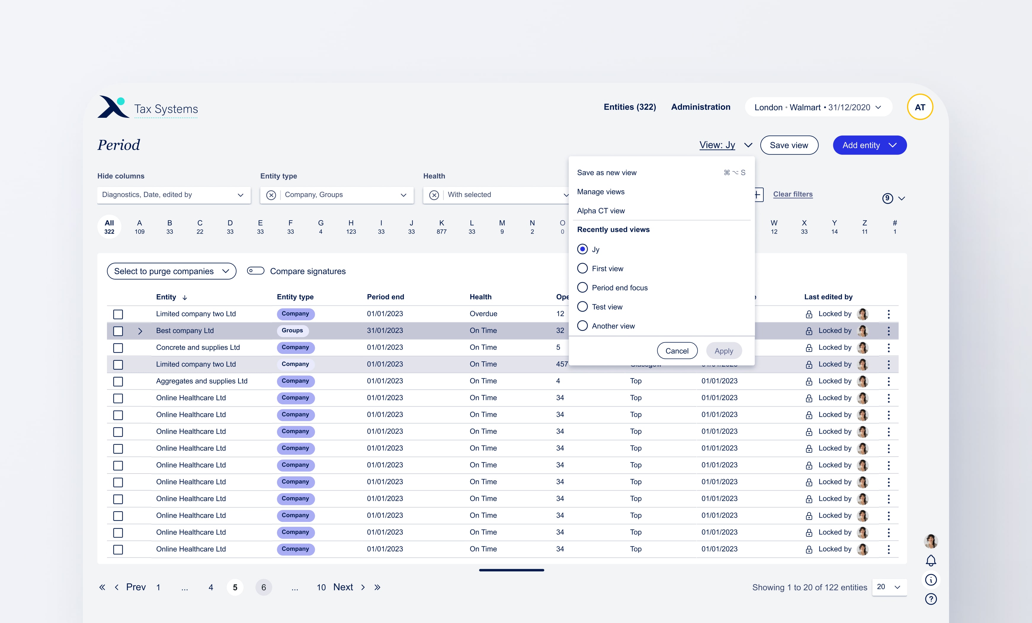
The indicator shows that there are filters being hidden. Once the collapsable filter section is opened it shows all the filter amount in this case, it's 9.
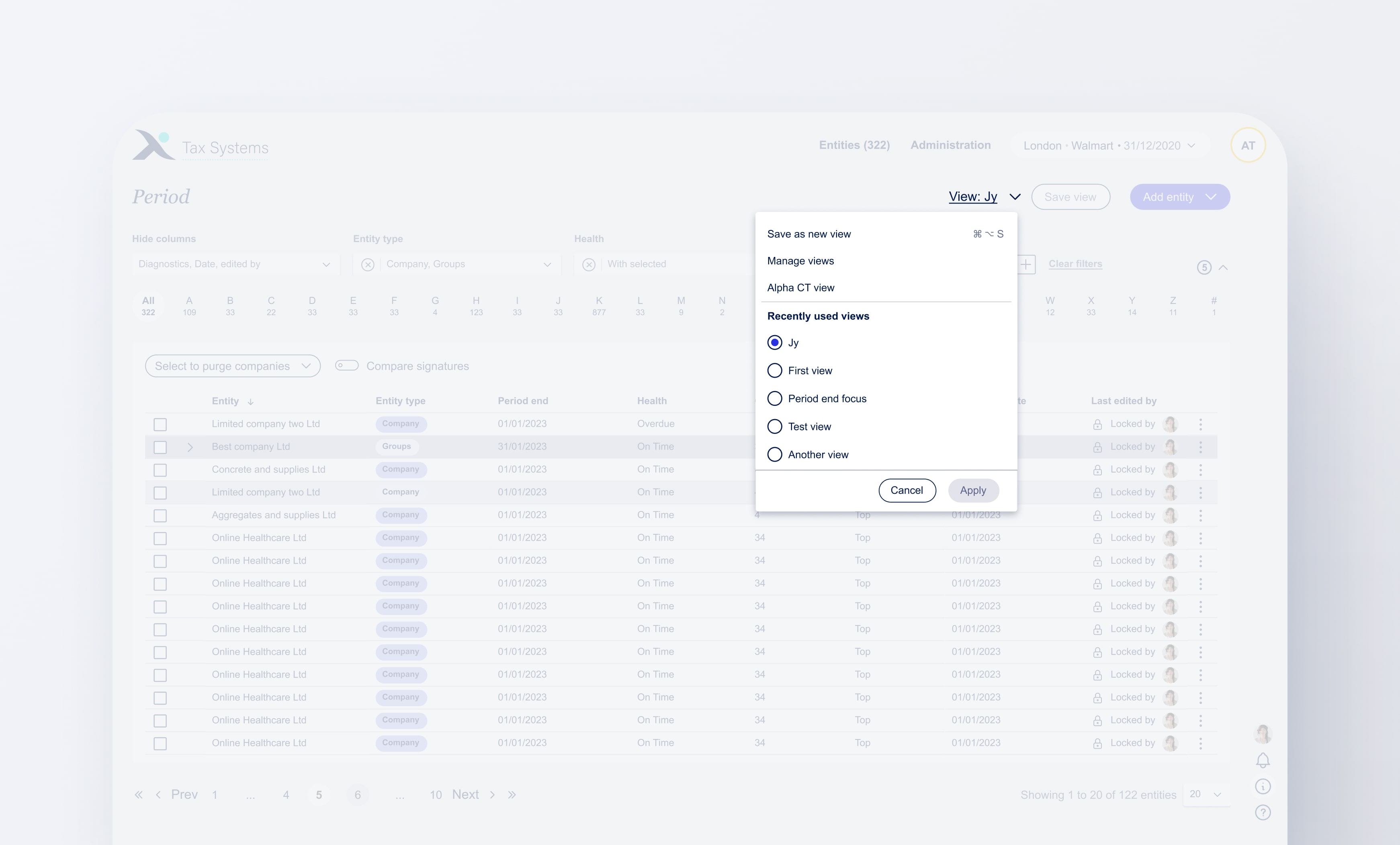
Save button
A major key asect of this solution is having the ability to save view. Placing the save view where it can clearly be seen an not within the "view dropdown" was intentional.
Save as a new view
For now on the first release after the user saved their first view, this feature becomes disabled. However, it was placed inside the dropdown as that's here the user goes to change views. Therefore, it only made sense for that dropdown also host adding a new view.
Removeable filters
Another feature that did not make it to the release. Removable features that were brought into light as Tax Systems wants to ofer more filters. However, we also offer the option to hide columns, if a user hides a column they might not want that filter to always be visible taking limited space.
Team feedback
Keeping everyone in the loop
Throughout this project I was constantly keeping all stakeholders in the loop having regular calls for informational gatherings and design checkins.
For my final hand off I carried out 3 different calls with 3 different teams so that there would be no distractions and i can get final feedback on specific information or elements.
Design team
From the design team it was a checkin to show new components that were created such as the removable filters and the use case scenarios documented on the design system.
BA's
Ba's call was regarding a sort of checklist. A finl heck to make sure that all the objectives from the research and the user wants and needs were achieved as well as plans for next release.
Devs
This was to go over any questions they may have that I could address. (By this time I've spoken with them on feaibility and looked into the complictions that could arise). Getting their final thoughts on the timeframe, if they need anything further from mean extra prototype showing anything exta, etc..
All 3 depeartments
Within all 3 departments, they all know they can contact me regarding this solution during development should they need further information. I also facilitated checkins with the BA's after hand off to see how the development of the solution is going and if they need anything of if they have ran into any blockers.
Hand off
Handing off the designs for development
placed my design file into the shared Figma file that the devs and BA's have access to. I then updated my Jira ticket with the design solution link file.
The design team has access to my Miro board file that has all the reasons as to why the design solution was designed as is followed by all the key insights, research, user needs and pain points and key takeaways from team calls.
Reflection
My thoughts on this project
This was a great piece to work on. I agree that the period page needed a usability revamp and something to make it feel like it's "mine" (customisable). Ultimately, I can't hide the fact that I am a bit disappointed in the lack of usability testing due to the time constraint. Would have loved to carry out a user test between the right hand pane vs the proposed solution.
Until the next release comes out, to me, the design solution addresses the user's needs but feels like a bandage without actually digging into the root cause of solving the user's problems.
I am very happy how the new table functionality turned out showing the filters even when the page is scrolled and I really like howevn tho it's not possible to remove filters yet, users ar able to hide all the filters and only have 4 showing. Saving 40% of filter space!


.svg)
.svg)


.svg)
.svg)
.svg)
.svg)
.svg)