Retain International

A talent resourse management company.

My role
UX/UI Designer
UX Researcher
Team
Product Owner
Mobile Developers (2)
Line Manager (2)
Time frame
4 weeks
Tools
Figma
Microsoft Teams
DevOps
Tower
Overview
Retain International's highest paying client had threatened to move to a competitor unless a mobile timesheet solution was delivered. The existing product was desktop only, outdated, and inconsistent with the company's marketing brand. I designed the mobile timesheet feature from scratch, rebranded the entire mobile application, and built Retain's first mobile design system all within four weeks.
The Results
1. The highest paying client renewed their license after the mobile feature was delivered.
2. Users could log timesheets from anywhere, reducing missed hours and improving billing accuracy.
3. The rebrand aligned the mobile app with Retain's marketing brand for the first time, improving professionalism and user confidence.
4. The new design manager was so impressed the rebrand was extended to the desktop cloud product and marketing site.
"I loved the bright colours, I think that it's very important to promote new energy"
- Retain user tester
The Problem
Users were forgetting to log timesheets and the only way to do it was on a desktop.
No mobile timesheet feature
Users had no way to log hours on the go, meaning if they forgot at their desk, the hours went unrecorded. This led to inaccurate billing and payroll issues.
Outdated and inconsistent design
The mobile app no longer matched Retain's new marketing brand, undermining trust and professionalism with clients and users alike.
A client at breaking poin
Retain's highest paying client had formally threatened to leave for a competitor if a mobile solution wasn't delivered soon.
The Solution
A mobile timesheet feature built around how users actually log time with a full rebrand shipped in the same sprint. My research revealed two distinct user groups; roughly 70% log their hours weekly, and 30% log daily. The feature was designed to serve both without compromise.
Weekly logging (70%)
Users select a day and input hours in bulk, reducing the number of interactions needed for the most common use case.
Daily logging (30%)
Users can fill out each day individually and add multiple jobs as they go, without starting over.
Job filtering
Users with access to thousands of jobs can filter by name, status, or search directly, so finding the right job never slows the process down.
Multi-job selection
Users working across several jobs can log hours to multiple at once, removing the repetitive back and forth found in competitor products like Harvest.
Full rebrand & mobile design system
The original blue and white design was replaced with a modern green and white framework that matched Retain's marketing site. I built the first mobile design system simultaneously, giving the team a consistent foundation for every future feature.
Users are forgetting to log their timesheets using
the Retain Cloud application. Something needs to changešŸ“± ..
Constraints
The challenges faced
Scope creep
The original design was in blue and white. With the transition to a new manager, I proposed a UI design. This resulted in a complete rebranding of the mobile app within the same sprint.
Missing mobile design System
I simultaneously designed the timesheet feature, revamped the app and created Retain's first mobile design system in a green and white framework for consistency in future features.
Dev communication
I collaborated with developers, leveraging my Swift skills to align and fix Xcode builds. I attended weekly mobile dev stand-ups to ensure smooth progress with the new framework and timesheets feature.
Leadership change
During the sprint, I found myself reporting to two line managers while single-handedly executing an application rebrand. A challenge I was being pulled in different directions from manager calls & feedback.
User research
The user's needs, wants &Ā their pain points
I collaborated with the product owner to establish when users log their time. Although precise measurements weren't feasible, we found that roughly 70% of users log their time on a weekly basis, while the rest do so daily.
Needs and wants
Our research reveals a need for a mobile app that tracks daily and weekly work hours, syncing to the cloud for accurate logs. This app will help users bill clients precisely and find suitable job matches. It should support both daily and weekly tracking, ensuring flexibility and secure, accessible data across devices.
Pain points
Users currently face limitations with the existing system, as it relies on a computer or laptop for logging time. This dependence becomes inconvenient when users forget to upload their worked hours, resulting in inaccurate billing. There is a clear need for a more reliable solution to ensure precise time tracking and billing.
So it really comes down to..
Weekly and daily users
From the research conducted there are 2 user groups; Weekly and daily input users. Regardless of their timesheet input behaviour, both users are struggling with logging in the worked hours into their digital timesheets. Causing disturbance in what jobs they are matched with and billing clients.
user stories
Looking at why there is a need for mobile timesheets from a user perspective
From the user research I created a couple of user stories to empathise with the user.
TailGate Media
Total hours: 16.4
Jane Stevenson
1. I want to be on top of filling in my timesheets so that I can ensure it has been approved by my manager and processed for payroll.
2. I want to be able to submit my timesheet every week so that I worry about forgetting to submit it at the end of the month.
3. I want to view my timesheet history and track my progress to see how my time management has improved over time.
4. I want to be able to manage my timesheets remotely so that I don't need to log into the system but rather update on the go.
5. I want to be able to easily view which project I am currently working on so that I can ensure I am billing the correct project.
How might we allow our users to effortlessly log their worked hours into their digital timesheets with ease and efficiency, reducing the burden of logging in timesheet hours?
Storyboarding
Bridging a gap to log timesheets from anywhere at anytime
Competitor analysis
What are other companies out there doing?
As I looked into our main competitors I realised our main competitors don't offer timesheets as a service or feature so I looked at indirect competitors such as Harvest.
HarvestĀ 
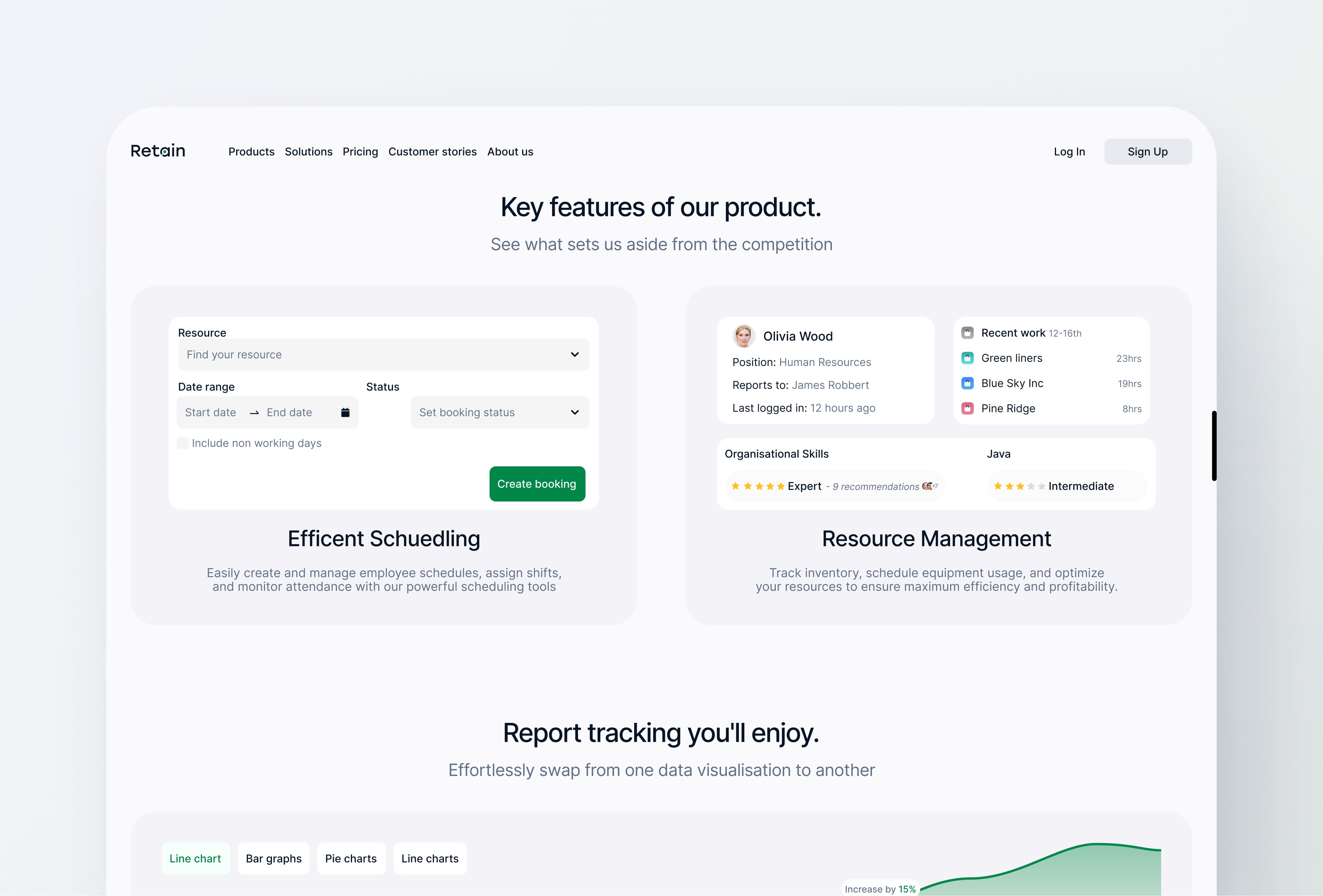
What can we learn from Harvest?
Harvest's main goal is to track time. However, to track daily time, whilst it solves the issue of logging time through a mobile device it's not tailored to our users where just under 3/4 prefer to log their time weekly
Pain Point
Oppurtunity
Repetative process
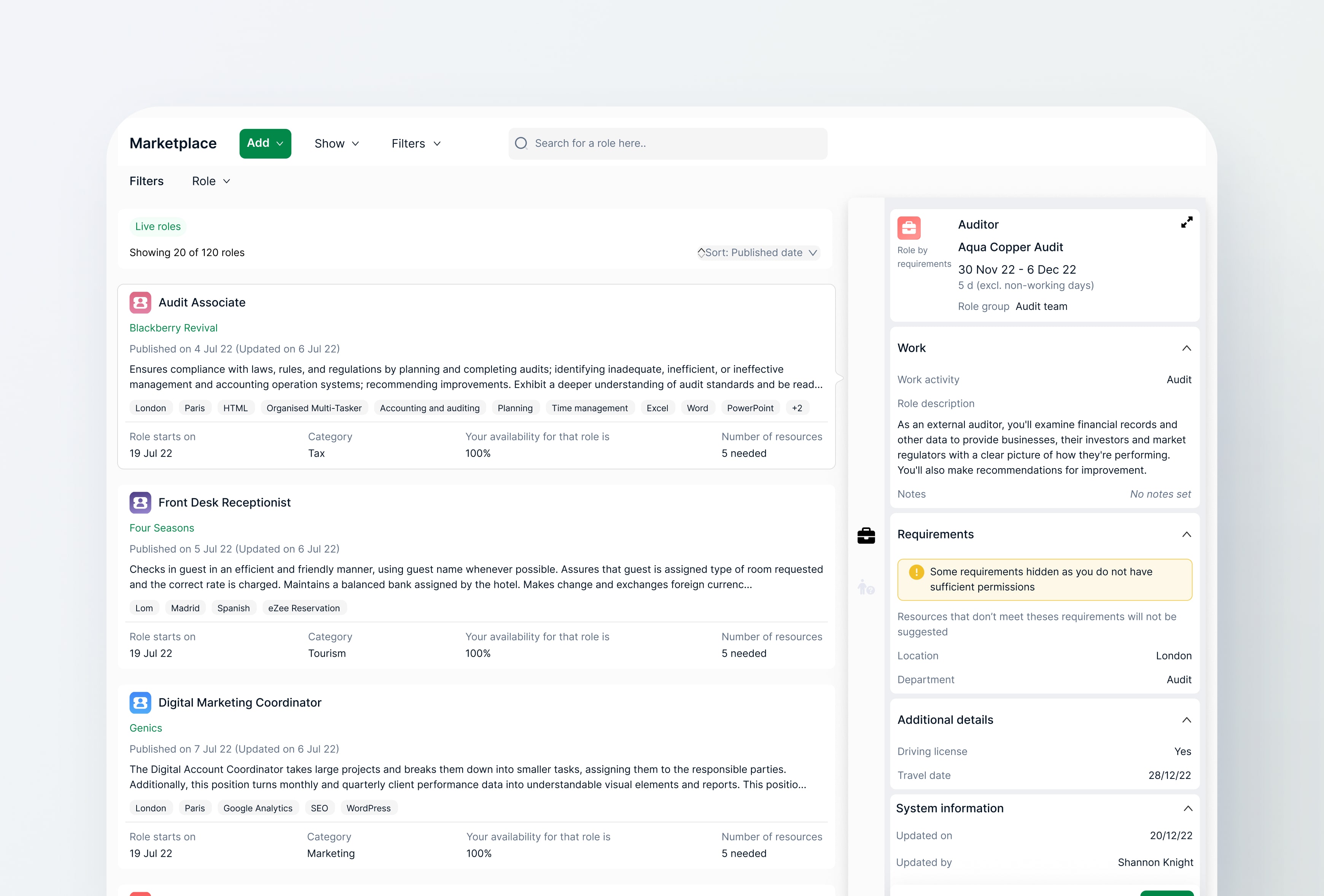
Users can't log multiple jobs simultaneously, which frustrates those needing to input several without redoing everything.
Quick Toggles for efficient timesheets, with customisable options to add common hours adds a nice touch.
Daily log in
Harverst only allows you to see your hours per day and not all at a week's glance.
Provide a weekly overview for quick assessment of job hours worked.
User flow
Mapping out the user's steps
The user flow was created for the product, dev and design team to have a full view of the new feature and its functionality but also allowed me to identify any gaps in the user journey.
Low fidelity wireframes
Getting ideas into visual mvps
At this stage, my design team was under a joint new management, both my line manager and my new liner manager were working together. I designed a few low-fidelity wireframes of how the design could look to my new line manager, product owner and devs to see if they have any issues with the proposed idea.

One technical issue I brought up was what if they don't have an internet connection.Long story short, as long as they loaded their jobs when they had an internet connection the user can log their times and it will be cached and updated once there is a viable connection.
Design Decisions
Every choice was done with the user's goals and pain point in mind
Empty state & choosing jobs to log worked hours
Users work on multiple jobs throughout the week, for that reason the option of choosing more than one job at a time was available.
Logging hours to accommodate 70% of weekly input users
Since around 70% of our user base fills their time weekly, the design was more accommodating to bulk logging time where user chooses the day and inputs the amount of hours worked.
Accommodating to the other 30% of daily users
Understandably, over a quarter of our user base prefers to fill their timesheets daily. The process is not any different, once the user fills out the first day they can edit the remaining days and add more jobs on the top right.
Deleting logged hours
Deleting logged timesheets is possible with 2 clicks.
Filtering the job list
A user might have access to thousands of jobs, but that does not mean that the person has worked there. For that reason the user is able to filter out by name, status etc or simply search for their job.
Job icons
I added these icons to bring colour into the application and to give it a more quality and premium feel, our users deserve better.
Add job button
For a more premium look and feel and as well as to cater for jobs with longer names the add text was removed and the plus icon stayed.
User testing
Remote usability testing
I created a prototype for user testing using Figma and facilitated remote sessions via Microsoft Teams. While I could only engage 5 users, I also enlisted feedback from 3 Retain team members to ensure thorough validation of the designs.
What did the test results show?
The users didn't struggle to complete the tasks and navigate their through the timesheets.

However, 4 out of 7 didn't know they could swipe to delete, which is interesting as Gmail has the same feature so I asked if a bin icon would be more intuitive and they agreed.Below is the design difference from the user testing results.
The original
How the design would have looked
I mentioned at the start I redesigned the entire application, this is how the design would have looked with the orignal UI

I spoke to my new line manager about modernising the platform and our concerns about the missing mobile design system and was happy for me to carry out the redesign of the application.
Fun fact
Enhancing the entire company (designwise)
My new line manager liked the redesign of the mobile application so much we set out as a team to design the desktop cloud product as well as the marketing site. Unfortunately, I left Retain before I could see the cloud application live. Retain's parent Company (Capita) sold Retain to another company and from what I can see the designs are still yet to be made live. Below you can find some of the designs I worked on.
Dev hand off
How I handed off the designs for development
The hand-off process included meetings with devs and product owners. I documented the design process on Visual Code, uploaded it to DevOps via Tower, and provided ongoing support. Accessing the Retain Test Flight app also prompted additional dev meetings.
Out of scope designs
Functionality that didn't make it in this release
Unfortunately, adding additional features was out of scope. I liked the Harvest's time quick toggles. Below is a design for how the adding time could have looked on the application.I do understand why it was out of scope for this milestone at least considering this was supposed to be a mobile feature only and turned into an entire platform rebrand with its design system
Reflection
My thoughts on this project
This project was messier than it looks on paper. A scope change mid-sprint, a leadership transition, and the pressure of a client about to leave all within four weeks. What started as a single feature became a rebrand, a design system, and the foundation for a platform-wide redesign.The biggest lesson was that proposing the rebrand was a risk worth taking. It added pressure in the short term but delivered far more value for users, for the client, and for the design team that came after me.

The mobile design system is what I'm most proud of. It wasn't asked for, but without it the rebrand would have been inconsistent and unmaintainable. Doing it right once saved the team from doing it badly many times over.
Leading mobile designs
From here on any mobile ticket was given to me so I was in charge of the mobile application as well as maintaining and updating the mobile design system.